How to Choose and Test a Font for a Wordmark
Pick a wordmark font with the real brand name, refine its spacing, test it small and on dark backgrounds, check the font licence and hand over usable logo files.
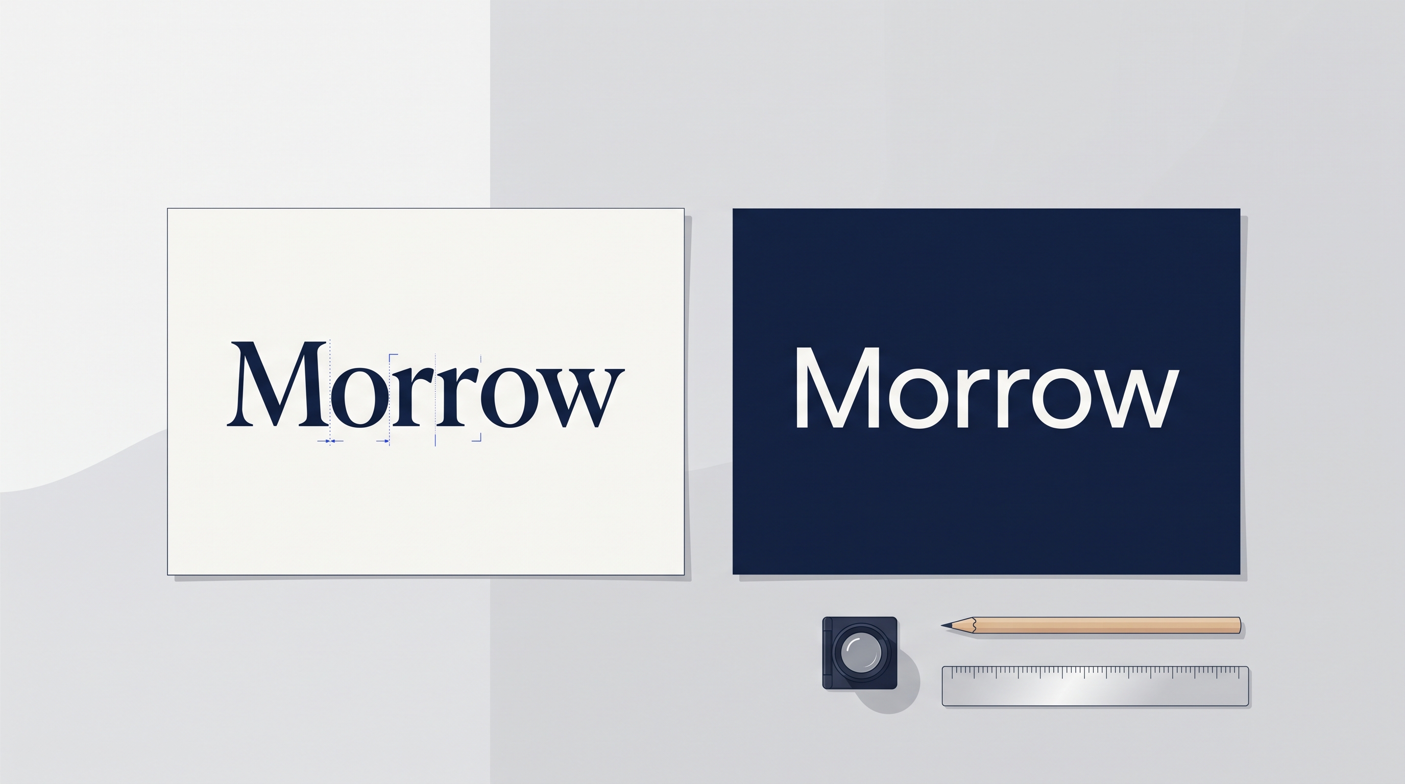
A wordmark can look convincing on a large presentation slide and fall apart in a website header. Thin strokes disappear, a pair of letters looks like a different character, or an impressive custom detail makes the name harder to read. Those problems are easier to fix before the logo reaches packaging, templates and client files.
A wordmark is a logo built around the written name of a brand. Choosing its starting typeface is only part of the design work. The practical task is to turn that name into a reliable mark, test its uses and deliver files that other people can apply correctly. Begin with the actual word and the smallest important application, then work toward the larger presentation.
The review below covers the shortlist, letter spacing, size and background tests, real brand cases, font licensing and the final handover. It separates decisions about a logo from decisions about the wider type system, because a successful wordmark does not automatically provide a suitable font for every paragraph.
Build a shortlist with the real brand name
Set the complete name in a few meaningfully different candidates. Keep the colour and surrounding layout constant so that the comparison concerns the lettering. A beautiful sample alphabet or a polished font specimen is not enough: your name may contain repeated letters, awkward pairs or a long ending that changes the result.
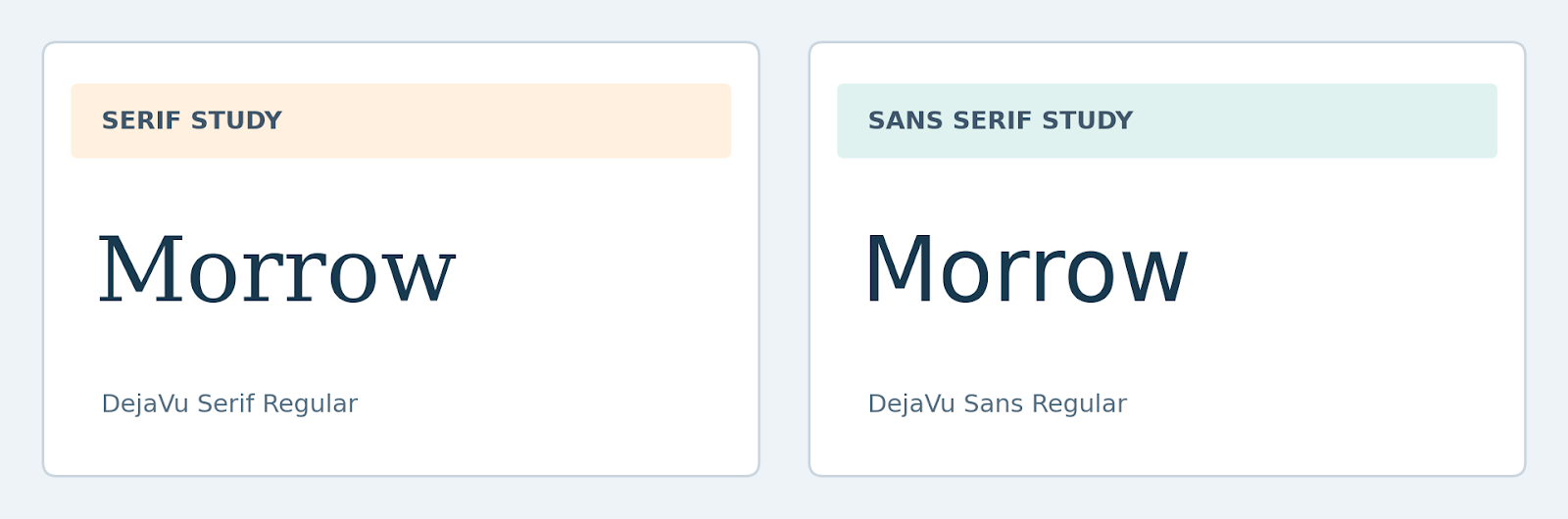
Compare candidates at a similar apparent size, not only at an identical point size. Different families can occupy different visual heights. Inspect the shape of the whole word, the relative weight of its letters and the empty spaces around them. Ask someone unfamiliar with the project to read the name before explaining what it says.
Turn brand adjectives into design questions
A brief that asks for friendly, confident and contemporary lettering leaves plenty of room for interpretation. Add concrete questions. Should the mark remain restrained beside product photography? Does it need to fit a narrow navigation bar? Must it accommodate a second language or a descriptor underneath? Those requirements make a shortlist easier to discuss.
Do not assign fixed personalities to entire categories. A serif does not guarantee prestige, and a sans serif does not guarantee simplicity. Look at the particular design, its spacing and the context around it. Present the reasoning for a candidate rather than relying on a category label to justify the choice.
Refine the word before decorating it
Start with ordinary typesetting and inspect the gaps. Kerning adjusts the space between particular letter pairs; tracking adjusts spacing across a selection. A global spacing change may improve the overall density while leaving one pair visibly awkward. Review both the sequence of letters and the shape of the entire word.
| Observed problem | First adjustment to try | Shortcut to avoid |
|---|---|---|
| One gap dominates | Review that letter pair | Tighten every gap equally |
| Word feels too dense | Revisit weight and overall spacing | Add an outline to separate letters |
| Letters become ambiguous | Check forms and small-size rendering | Explain the name to every viewer |
| Long name will not fit | Review layout or an approved variant | Stretch or squash the artwork |
| Descriptor disappears | Give it a separate size rule | Scale the whole lockup indefinitely |
Consider a fictional name containing an r followed by an n. At some sizes and in some styles, the pair can be mistaken for an m. A subtle spacing change may help, or another candidate may handle the sequence better. The point is to test the actual name rather than assuming that all letters work equally well in every combination.
Keep modifications purposeful
Changing a terminal or joining two letters can make a wordmark distinctive, but it also introduces another detail to reproduce. Ask what each change improves. If the answer is only that the logo looks more customised, compare the modification with the unaltered version at the smallest intended size.
Keep an editable master and a record of the selected family and version. If you convert lettering into vector paths for a production copy, retain the earlier source separately. This makes later corrections possible without guessing which font, spacing values or letter edits produced the approved design.
Test the mark in its least flattering applications
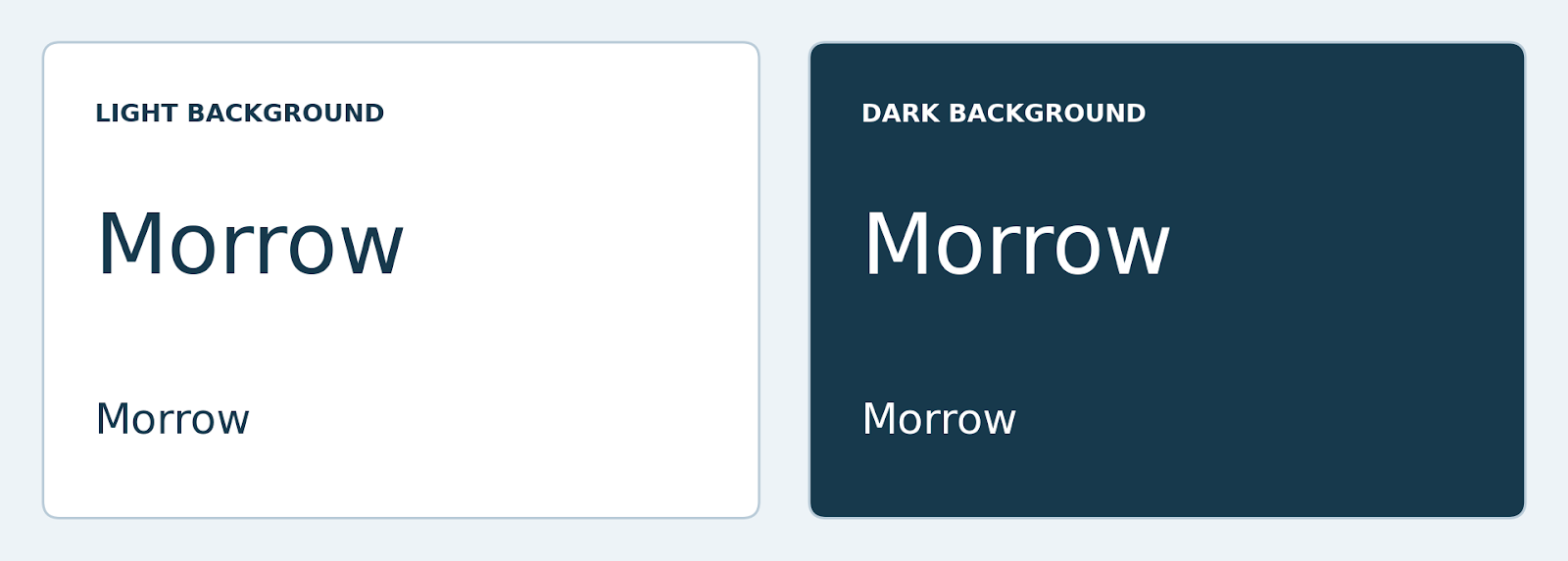
Prepare a proof sheet with a light background, a dark background and a plain one-colour treatment. Include a large reference and the smallest intended uses. The goal is to reveal the limits of the design, not to make every sample look impressive with texture, lighting and mockup effects.
Inspect the exported artwork at its intended display size. Zooming into a vector file confirms that it is scalable, but not that its fine details remain visible in a small raster image. Print a sample when labels, stationery or packaging are part of the brief, and review a production proof for specialised processes.
Create variants instead of forcing one layout everywhere
A long wordmark may work in a website header yet be unsuitable for a square avatar. An approved compact mark or monogram can serve that smaller space, while the full name remains elsewhere in the interface. Do not invent the compact version at the last minute by cropping letters out of the original.
Record which version belongs in which setting. Separate a logo with a descriptor from the version without one, and define enough clear space to keep surrounding content from crowding the mark. Avoid presenting an arbitrary minimum width as a universal rule; establish the limit through the actual artwork and medium.
Learn from the relationship between logos and brand fonts
Sartorius provides a direct example of that relationship. The foundry’s published case identifies a customised TT Norms® Pro as the basis for the company’s logo and as its corporate font. The case connects a specific mark with a broader family, rather than treating a logo as the entire identity.
Domino’s Pizza illustrates the wider system. Its updated typefaces, Dominos Sans Display and Dominos Sans Text, were developed through customisation of TT Commons™ Pro, in collaboration with WorkInProgress. The published case says they “shape the brand’s new corporate communications.” It does not mean that a designer should recreate the Domino’s wordmark by typing the name in the retail family.
Crocs offers another useful distinction: its website uses a customised TT Norms® Pro. That is evidence about a website typeface, not proof that the same font created the Crocs logo. When researching a familiar brand, identify whether a source describes the wordmark, a campaign headline or general interface text before drawing a design conclusion.
For a smaller project, plan both layers. The logo can have carefully adjusted lettering, while a compatible reading family handles descriptions, buttons and longer copy. The supporting font should relate to the identity without repeating every unusual detail of the mark. A customised logo does not require an entire custom alphabet.
Check the font licence before approving the artwork
When comparing candidates at TypeType, test the name in realistic layouts and check the permissions needed for the final use. The foundry lists a dedicated Logo licence alongside Desktop and Webfont options. Do not assume that a permission covering ordinary static graphics necessarily covers every logo application.
Its licensing guidance states that the Logo licence “allows you to use the font to create a logo.” Read the full agreement and clarify who is covered, how the final mark will be used and whether the proposed modifications are permitted. Other suppliers may organise these rights differently.
Also distinguish editing a wordmark’s vector artwork from modifying and distributing font software. If your workflow involves altering font files, sharing them with contractors or supplying them to a client, ask about those actions specifically. Turning text into outlines is a production technique; it should not be treated as a substitute for the required permission.
A font licence and the rights to a downloaded logo asset are separate matters. A logo library may supply useful material for prototypes, examples or permitted commercial uses, but inspect the licence for the asset you select. Do not treat a template or a familiar brand mark as evidence of exclusive ownership of a new identity.
Deliver a usable logo package
The final handover should explain which file to use, not merely contain a folder of exports. Give the versions descriptive names and include a short guide to backgrounds, size limits and any descriptor. Supply the file formats required by the actual workflow and verify each export rather than relying on its extension.
| Deliverable | Useful purpose | Check before handover |
|---|---|---|
| Vector artwork | Scalable production master | Shapes, spacing and editable contents |
| Transparent raster export | Placement in compatible applications | Resolution and clean edges |
| Light and dark versions | Approved contrast treatments | No improvised recolouring |
| Compact variant | Small or square placements | Recognisable at its intended size |
| Usage notes | Repeatable application by others | Versions, clear space and permissions |
Avoid claiming that one file format solves every production problem. A scalable outline can still contain an unsuitable detail for embroidery or a tiny stamp. Ask the production supplier for the relevant constraints and inspect the resulting proof. A screen preview and a physical output answer different questions.
- Confirm the name is read correctly without prompting.
- Inspect spacing at large and small sizes.
- Check light, dark and one-colour applications.
- Verify the permissions and the client handover arrangement.
- Keep the source master and identify approved exports.
Frequently asked questions
Should I choose a serif or a sans serif for a logo?
Compare the actual brand name in both where they fit the brief. Evaluate letterforms, spacing and performance in the intended applications. Neither category guarantees a particular personality or level of readability. The best candidate is the one that supports the specific identity and survives the practical tests.
Can I use the same font for the logo and body text?
Yes, if the family works in both roles, but test them separately. A wordmark may use manual spacing or edited letters that should not be repeated in paragraphs. Define a regular reading style for supporting copy instead of assuming that the logo treatment can simply be scaled down.
Does converting a font to outlines remove licensing obligations?
Do not assume that it does. Outlining changes how the artwork is stored, while the font agreement governs permitted use. Check the relevant terms before creating, modifying or delivering the mark, and clarify the rights needed for anyone who will receive the font files.
How small can a wordmark be used?
There is no universal minimum. Test the specific mark at the actual size, on the intended background and in the delivery medium. If the name or descriptor stops reading clearly, use an approved alternative or increase the space. Record the tested limit in the usage notes.
Do I need a custom typeface to make a distinctive logo?
Not necessarily. An appropriate retail family, thoughtful spacing and restrained artwork adjustments can support a distinctive wordmark. A custom typeface is a broader project that makes sense when you need a repeatable alphabet for many uses. Define that need before extending a logo brief into font development.
Approve the wordmark only after the name, proportions and smallest important use have been checked. Then give the next person clear files and clear rules. A reliable logo is one that continues to work after it leaves the designer’s presentation.