🔥 Modulify.ai - Design Webflow sites with AI →


What changed, why it happened, and what every designer canlearn from the year's most talked-about rebrands.
Every few years, a wave of rebrands rolls through the designworld and tells us something about where brands think they need to go. 2025 was one of those years. From subtle gradient tweaks on icons used bybillions, to full identity overhauls that broke the internet, the last twelvemonths delivered a masterclass in how global companies use logo design tosignal transformation.
The reasons brands refresh their logos have always been thesame: modernize for digital screens, reposition after a strategic pivot,adapt to new audiences, or unify a fragmented visual system that grew fasterthan anyone planned. What makes 2025 particularly interesting is that a newforce entered the picture: AI. Multiple brands explicitly citedartificial intelligence as both a reason for their redesign and an influence onthe aesthetic direction.
In this article we cover ten of the most significant logoredesigns and rebrands of 2025. For each brand we break down what visuallychanged, why the redesign happened, and the key design lesson behind thedecision.
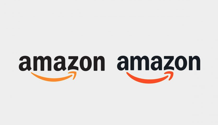
First rebrand in over 20 years | Agency: Koto Studio + Amazon XCM
• Smile icon: thicker shaft, deeper curve,richer "Smile Orange" — a new custom brand color
• Wordmark: replaced with Amazon EmberModern, a bespoke typeface developed with NaN Foundry, supporting 364 languagesacross seven weights
• Sub-brand system: more than 50 sub-brandsunified under a single master identity for the first time
• Color palette: standardized to SmileOrange plus a more saturated, digital-friendly blue
Amazon's previous logo had not seen a major update since itscreation in the year 2000. In that time the company expanded from an onlinebookstore into cloud computing, streaming, healthcare, grocery delivery, anddozens of other verticals. Each sub-brand team adopted its own fonts and visualapproaches, creating what agency Koto described as a fragmented andoperationally hard-to-execute brand system.
The 2025 refresh was fundamentally a unification project.The goal was not a dramatic visual reinvention but a cohesive system that couldflex from a delivery van to a smartwatch interface without losing its identity.The warmer, deeper smile was meant to emphasize Amazon's customer-centricmission more explicitly.
When a brand grows into 50+ sub-products, a typeface systemmatters more than any single logo change. Amazon's investment in a customglobal typeface — one that works across 364 languages and seven weights — is atextbook example of brand architecture at scale.
First G icon update since 2015 | Launched: May 2025
• G icon: solid flat color wedges replacedby a seamless gradient flowing through red, yellow, green, and blue
• Wordmark: unchanged — the 2015 ProductSans lettering remains intact
• Gemini logo: updated in July 2025 tomatch the same gradient visual language
• Rollout: applied across iOS, Android,web, and progressively all Google products
Google's last major visual identity overhaul was in 2015. InMay 2025, it rolled out its first significant update to the iconic"G" in nearly a decade — and it landed with almost no controversy.The change was deliberate and surgical: the four colors that everyone alreadyassociates with Google now blend into one another rather than sitting asdiscrete wedges.
The motivation was clearly AI-era alignment. Google confirmedthe gradient update was designed to "visually reflect evolution in the AIera" and to create visual harmony with the Gemini logo. According to Google's official announcement, the brighterhues and gradient symbolize the surge of AI-driven innovation across itsproducts.
Gradients are back — not as the gaudy Web 2.0 gradients of themid-2000s, but as subtle depth signals. Google used a gradient to communicatedynamism and AI intelligence. This is a deliberate move away from flat design'sdecade-long dominance. When your icon is used by billions of people daily, evena subtle update registers at enormous scale.

Custom typeface launch | Agency: Jones Knowles Ritchie(JKR) | Rolled out: January 2025
• Spark icon: made "slightlyfuller" to feel warmer and more present — same six-petal shape, moregenerous proportions
• Wordmark: updated to Everyday Sans, acustom typeface inspired by founder Sam Walton's handwriting
• Color: blue deepened for better digitalperformance; yellow made more vivid
• System: rolled out across 10,500+ stores,apps, website, delivery fleet, and marketing throughout 2025
Walmart's official announcement framed the refresh as adeclaration of identity: a "people-led, tech-powered omnichannelretailer." The brand did not attempt to distance itself from its heritage.Instead it tightened what already worked, developed in partnership with Jones KnowlesRitchie and Walmart's in-house team.
The practical driver was consistency at scale. When your logoappears across a drone delivery fleet, a mobile app, a television ad, and theside of a 53-foot trailer, tiny inconsistencies compound into brand noise. Thecustom typeface ensures every touchpoint speaks with one visual voice.
The most powerful move in Walmart's rebrand was commissioninga typeface inspired by its founder's handwriting. Custom typography doesn'tjust signal budget — it says the brand is too specific, too singular, to bedressed in anything off-the-shelf. At 10,500+ locations, that distinction isworth the investment.
10 core app icons redesigned | First update in 7 years | Launched: October 2025
• 10 core icons: Word, Excel, PowerPoint,Outlook, Teams, OneNote, SharePoint, Defender, OneDrive, and Access allredesigned
• Shape language: angular, geometric shapesreplaced with curved "fluid" forms that wrap and overlap
• Word icon: simplified from four stackedrectangles to three, improving legibility at small sizes
• Color: richer gradients replacing flatsolid fills; each app gets a distinct expressive color range
• Visual direction: the Copilot logo'saesthetic set the northstar for the entire suite redesign
The previous icons dated from 2018 — an era when Microsoft wasfocused on cross-platform consistency. By 2025, the paradigm had shifted.Workflows are no longer just human-to-human; they are increasingly human-to-AI.Microsoft's design VP Jon Friedman stated that the icons "encapsulate howAI is shifting the discipline of design." This was the first update tothe Office icon set in seven years.
By pulling the visual system of legacy productivity appstoward the fluid, gradient-rich identity already established by Copilot,Microsoft created a clear visual signal: AI is not a feature bolted on — it isnow the core of how the suite works.
Designing an icon system is a systems problem, not a visualproblem. Microsoft's decision to let the Copilot icon set the aestheticdirection for all 10 apps is smart brand architecture: one northstar, dozens ofconsistent executions. Every icon update reinforced the same message aboutAI-first workflow.

Most controversial automotive rebrand of the decade | Fullidentity overhaul
• Leaping cat emblem: removed from theprimary brand identity
• Wordmark: all-caps, ultra-wideletter-spacing, ultra-thin weight — a stark departure from heritage serif
• Color palette: moved toward pale luxuryneutrals, away from traditional British racing green and chrome
• Positioning: repositioned as a premiumelectric-only luxury brand targeting a younger affluent audience
Jaguar is undergoing a full transition to electric vehiclesand made a bold strategic decision: rather than modernize its heritage, itchose to largely abandon its visual past. The leaping cat that had definedthe brand for decades was sidelined in favour of a minimal wordmark that couldsit alongside luxury EV competitors without looking like a legacy car brand.
The reaction was fierce. Social media criticism waswidespread, with many fans and designers arguing the new identity was genericand stripped the brand of its most valuable asset: decades of distinctiveautomotive personality. Jaguar leadership maintained that the rebrand wasintentional and targeting a completely new buyer demographic.
Jaguar's rebrand is a case study in strategic ambition versusbrand equity management. When a brand's heritage is its greatest competitiveadvantage, abandoning it entirely is a very high-stakes bet. The coming yearswill test whether the minimalist identity attracts the new audience Jaguar istargeting — or whether it alienated the loyal buyers it already had.
Proposed redesign reversed within days | Oneof 2025's most viral brand moments
Cracker Barrel attempted what seemed like a standardmodernization: remove a detailed illustration, clean up the type, make the logomore versatile across digital touchpoints. The proposed redesign dropped UncleHerschel — the beloved mascot featured in the chain's original 1970s logo — infavor of a simpler wordmark.
The backlash was swift and overwhelming. Social media erupted,major news outlets covered the story, and within days Cracker Barrel reversedcourse: "We said we would listen, and we have." The old-timerstayed.
The Cracker Barrel saga is one of the most instructivebranding stories of 2025. It demonstrates that nostalgia is not a bug in abrand — it can be the entire product. Cracker Barrel's customers do notvisit for a modern dining experience. They visit precisely because the brandfeels like 1975. Removing the most visible symbol of that feeling was a misstepthat no amount of clean typography could compensate for.
Before removing a beloved brand character, ask: is thiselement outdated, or is it the reason people love us? Audience research beforethe redesign — rather than crisis management after — would have revealed thisquickly.
Biggest change to the Winged B in 100 years | In-house team led by Robin Page
• Lower feather detail: removed from theWinged B for the first time since 1919
• Wing geometry: simplified and sharpenedwith a diamond pattern — more angular and contemporary
• Color system: maintained the black,silver, and white palette; red, green, and black sub-brand colors preserved
• Overall tone: confidence throughrestraint, aligned with the brand's electrification roadmap
Bentley is moving toward electrification. The brand needed anidentity that could credibly represent an electric grand tourer without lookinglike a museum piece. Design lead Robin Page made surgical edits to acentury-old mark — removing historical ornamentation while preserving theessential geometry that makes the Winged B instantly recognizable worldwide.
Luxury brands face a unique tension in any redesign: too muchchange destroys the patina of age that customers are actually paying for.Bentley's approach — removing one specific decorative element whilestrengthening the core geometry — is a model for how to modernize a heritagemark without erasing it. Know which elements are ornament and which are identity.
Custom typeface + unified system across ChatGPT, API, andenterprise products
• Custom typeface: OpenAI Sans — describedas combining "geometric precision and functionality with a rounded,approachable character"
• Wordmark prominence: the wordmarkpromoted to primary mark; the circular blossom icon repositioned as secondary
• System cohesion: ChatGPT, DALL-E, API,and enterprise products pulled toward a unified visual identity
• Color palette: updated for consistencyacross product interfaces, marketing, and developer materials
OpenAI grew from a research lab into a mainstream consumerbrand in roughly two years. That kind of growth outpaces identity systems. By2025, the company had multiple product lines each developing their own visualflavors, and the brand needed a coherent system that could work across achatbot used by hundreds of millions, a developer API, and enterprise software.
The decision to lean on the wordmark over the symbolic blossomalso reflects a maturity in brand strategy: when your company name hasbecome a household word, the name itself is the logo.
A custom typeface is one of the highest-ROI investments abrand at scale can make. It eliminates licensing costs, creates an asset nocompetitor can use, and signals that the company is serious about every surfacewhere its brand appears. OpenAI's move from generic fonts to a bespoke typefacewas a statement of permanence.
"The Path" identity | Agency: BUCK + Instrument
• Logo symbol: new mark called "ThePath," representing the journey from discovering an event to making amemory
• Color palette: expanded to a vibrant,expressive range built for digital animation and physical print
• Typography: bolder, more expressive typesystem with stronger hierarchy
• Illustration style: playful illustratedcharacters introduced to make the brand feel more human and less transactional
Eventbrite needed to move beyond the perception that it wassimply a ticketing tool. The 2025 rebrand, developed in partnership with BUCKand Instrument, repositions the platform as a cultural hub for real-lifeexperiences. Every element of the new identity — from the animated pathsymbol to the illustrated characters — reinforces the idea that Eventbrite isin the business of human connection, not just transactions.
"The Path" is a great example of a logo that has astory built into its shape. Rather than an abstract mark, it communicates aspecific emotional journey. The best new logos in 2025 were ones that could beexplained in a single sentence. If you can't describe what your logo means inplain English, it may be working harder than it needs to.
First corporate identity update in nearly 25 years | Sustainability-led direction
• Wordmark: moved to a lowercase treatment— softer and less corporate in tone
• Color palette: earth tones introduced,moving away from the red, blue, and white that mirrors the US flag
• Iconography: simplified; corporate marksreduced to essentials
• Strategic signal: tied to pep+ (PepsiCoPositive), the company's sustainability transformation strategy
PepsiCo's corporate identity update was its first in nearly 25years. The shift from bold primary colors to earth tones is a deliberatesustainability signal — the visual language of a company that wants to be seenas environmental and globally minded. Critically, this is a corporateidentity update, separate from the Pepsi cola brand, which gives theholding company room to grow into non-cola categories without dragging thecola's visual equity.
Earth tones and lowercase wordmarks dominated 2025's corporaterebrand landscape. Both signal the same underlying message: approachable,planet-conscious, and not trying to shout. Whether the message is authentic isa different question — but the design direction is unmistakable and worthnoting for any brand undergoing a sustainability repositioning.
Download white logo variants in SVG + PNG
Looking across all ten redesigns, six clear trends emerge.These are not aesthetic fads — they each serve a functional purpose in the waylogos must perform in 2025's digital-first, AI-adjacent brand environment.
Google, Microsoft, and Eventbrite all moved away from flatcolor in favor of smooth gradients. Unlike the Web 2.0 gradients of themid-2000s, these are subtle depth signals that communicate motion, AI, anddynamism. Flat design served the touchscreen era well — gradients are servingthe AI era.
Amazon, Walmart, and OpenAI all commissioned bespoke typefacesin 2025. When a name is globally recognized, the typeface becomes the identity— not the icon. Custom type also eliminates licensing costs and creates anasset no competitor can replicate.
Google and Microsoft explicitly positioned their redesigns as"AI-era" updates. Fluid shapes, gradient blends, and animatedidentities were all framed as visual representations of AI's influence on howtheir products work. Expect this to continue as more companies integrate AIinto their core offering.
Amazon unified 50+ sub-brands. Microsoft unified 10 app icons.Walmart unified 10,500+ physical locations. 2025 was the year of brandarchitecture, not single-logo thinking. The deliverable is no longer a logofile — it's a system with rules, flexibility, and documented behavior acrossevery surface.
Bentley removed the lower feather. Google removed colorborders. Walmart simplified its spark. The discipline of knowing what to remove— not just what to add — defined the best rebrands of the year. Subtraction isharder than addition, and the brands that practiced it well came out strongerfor it.
Cracker Barrel reversed a redesign in under a week. Jaguarweathered intense online criticism that ran for months. In 2025, brand teamslearned that public response happens in real time — and can override boardroomdecisions. Stakeholder research now needs to include digital audience testing,not just focus groups.
Variable and responsive logo systems are now table stakes.A logo that only works at one size, in one color, is already obsolete. Everymajor rebrand in 2025 included documentation of how the identity scales from a16x16px favicon to a billboard, from a light-mode interface to a dark-mode app.If you're designing a logo without thinking about system behavior, you'redelivering half a project.
The "big reveal" brand launch is also changing.Amazon, Google, and Walmart all rolled out their updates gradually and quietly.This limits the attack surface for controversy while still reaching all usersover time. Compare this to Jaguar's bold launch — and the very differentreactions each generated.
Finally, heritage is not the enemy of modernization — butyou have to be precise about which elements carry equity. Bentley knew itsWinged B was sacred; the lower feathers were expendable. Amazon knew its smilewas beloved; the old typeface was just infrastructure. Cracker Barreldiscovered too late that Uncle Herschel was the product, not just a designelement. The pre-design research that answers "what do our customersactually love?" is the most important work in any rebrand brief.
2025 was a year that confirmed what design thinkers have beensaying for a decade: logo design is infrastructure, not decoration. Thebrands that did it well approached their redesigns as system problems, notaesthetic ones. They asked where their identity was failing at scale, whatelements were genuinely beloved versus merely familiar, and how their visuallanguage needed to evolve to work on surfaces that didn't exist when their lastlogo was designed.
The brands that struggled did so not because their designersmade bad choices, but because the strategic questions weren't fully resolvedbefore the pencils came out. A beautiful logo built on a wrong strategicpremise will always fail in the market.
For designers, the practical takeaways are clear: invest insystem thinking over single-mark thinking, master the discipline of strategicsubtraction, treat typography as a primary brand asset, and design for the 16pxicon and the 16-foot sign simultaneously.
Whether you're building a startup identity or refreshing ahundred-year-old marque, the challenge is the same: keep what people love,remove what's slowing you down, and build a system that scales.
Amazon's rebrand stands out as the most comprehensive,unifying more than 50 sub-brands under a new visual system for the first timein over 20 years. Google's gradient G update was the most widely seen, given itreaches billions of daily users. Jaguar's was the most controversial. Each"biggest" depends on what dimension you're measuring.
The most common drivers in 2025 were digital-first adaptation(logos needing to work on tiny screens and dark interfaces), brand systemunification (bringing fragmented sub-brands into alignment), strategicrepositioning (new product categories, sustainability messaging, EVtransition), and AI-era signaling (communicating that AI is central to theproduct, not peripheral).
Research suggests the average major brand undergoes asignificant logo update approximately every seven years. This varies enormously— Amazon went 20+ years between major updates, while some tech brands refreshannually. The pattern shifted post-2020 as mobile-first design demands and AIproduct launches accelerated the cadence for tech companies.
Cracker Barrel's attempted removal of its Uncle Herschelmascot generated the most controversy in terms of media coverage, ultimatelyforcing the brand to reverse its decision within days. Jaguar's minimalistidentity overhaul was the most sustained controversy, with industry debatecontinuing throughout the year.
The six major trends were: (1) the return of purposefulgradients, (2) custom typography as primary brand assets, (3) AI-influencedaesthetic language in tech brands, (4) system-level identity thinking oversingle-logo design, (5) strategic subtraction — removing elements rather thanadding them, and (6) increased brand vulnerability to real-time social mediafeedback during rebrands.
No. Google updated its G icon from solid flat color blocks toa smooth gradient in May 2025 — its first significant update to that icon since2015. The Google wordmark (Product Sans lettering) was not changed. Thegradient G was subsequently applied company-wide and used to visually align theGoogle brand with the Gemini AI logo, which also uses gradient design.
A logo brand system is the set of rules and assets that governhow a logo and its associated visual elements behave across every surface —from app icons to packaging to signage. Rather than a single static file, it isa flexible kit of parts. In 2025, brand systems became the dominant deliverablefrom major rebrands. Amazon's system covered 50+ sub-brands; Microsoft'scovered 10 core applications.
Subscribe to get fresh stories, tips, and logo resources delivered straight to your inbox.
'Stuff you need to read we cover it here


Design By OwlsTech Service


.svg)
