Logo Styles
|
Feb 7, 2026
Minimalist Logos Explained: Meaning, Types, and Real Examples
The world of branding has undergone a dramatic transformation over the past decade. Complex, ornate logos have given way to clean, stripped-down designs that prioritize clarity over decoration. This shift isn't arbitrary. It's a calculated response to how we consume brands in the digital age.
The world of branding has undergone a dramatic transformation over the past decade. Complex, ornate logos have given way to clean, stripped-down designs that prioritize clarity over decoration. This shift isn't arbitrary. It's a calculated response to how we consume brands in the digital age.
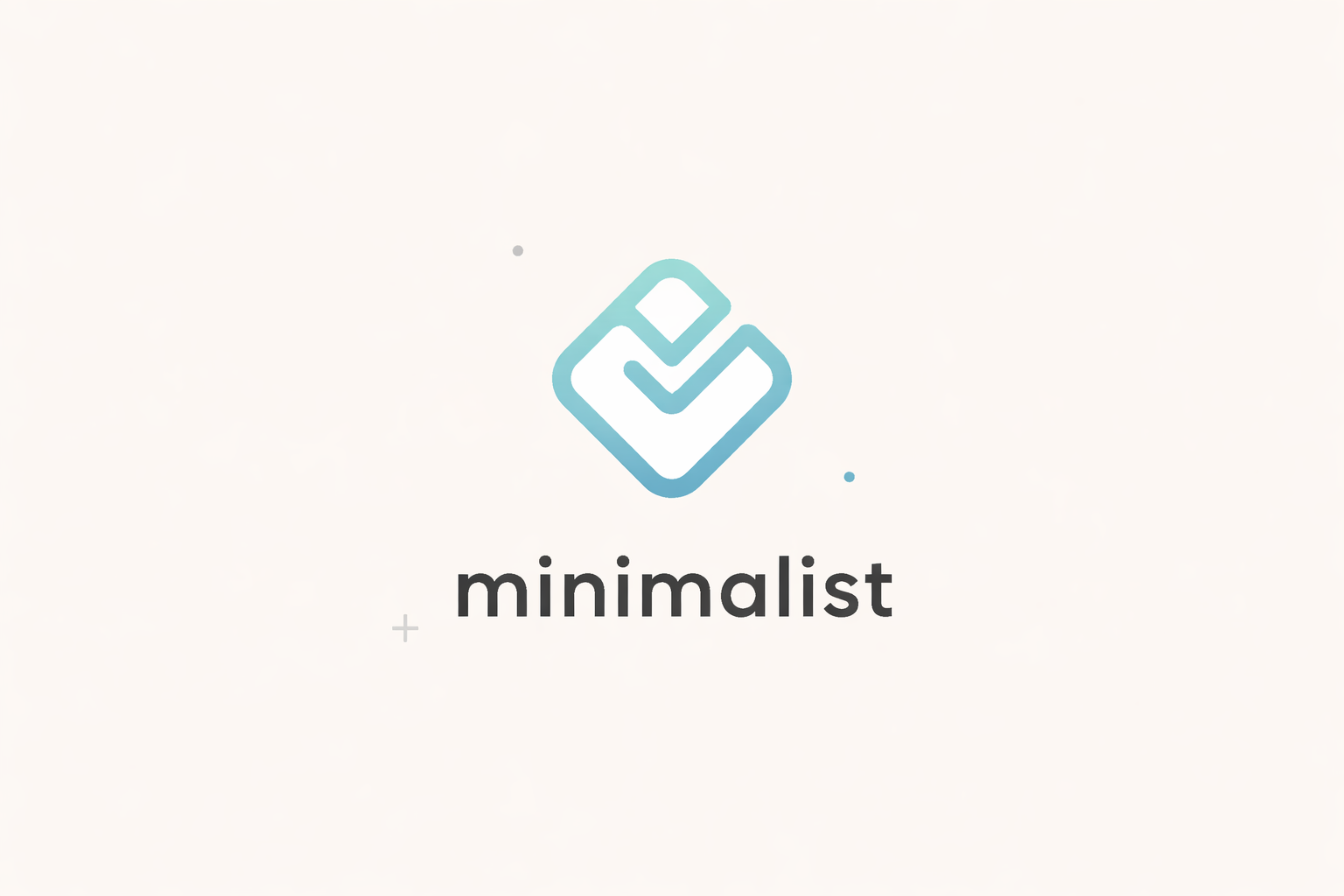
Minimalist logos are intentionally reduced visual systems designed for maximum clarity, scalability, and reuse across digital platforms. Unlike generic or oversimplified designs, effective minimalist logos are the result of careful reduction, where every remaining element serves a specific purpose.
This guide explores what makes minimalist logos work, when to use them, and how to implement them effectively. The examples referenced throughout come from placeholder logo assets designed for mockups, prototypes, and early-stage branding exploration, not official brand marks.
What Is a Minimalist Logo?
A minimalist logo is a brand mark that uses the fewest possible visual elements to convey its message. This doesn't mean boring or generic. It means intentional.
The defining characteristics of minimalist logos include:
Few visual elements. Every shape, line, and letterform must justify its existence. If removing an element doesn't weaken the logo's recognition or meaning, that element shouldn't be there. This principle of reduction creates designs that are easier to process and remember.
Simple typography or shapes. Minimalist logos favor clean sans-serif typefaces or basic geometric forms like circles, triangles, and squares. These foundational shapes scale better, reproduce more reliably, and remain legible at any size.
High contrast. Without decorative flourishes to create visual interest, minimalist logos rely on strong contrast between positive and negative space. Black and white versions often work as well as colored ones because the fundamental structure is sound.
No decorative effects. Gradients, shadows, textures, and bevels are absent from minimalist design. These effects don't scale down to small sizes, create reproduction problems across different media, and date quickly as visual trends evolve.
It's crucial to understand that minimalist is a style, not a logo type. You can have minimalist wordmarks, minimalist symbols, minimalist lettermarks, or minimalist combination marks. The style describes the approach to visual reduction, not the structural category of the logo itself.
According to a 2023 study published in the Journal of Brand Management, simplified logos significantly improve brand recall in digital environments where consumers make split-second judgments based on visual cues.
Why Minimalist Logos Dominate Modern Brands
The prevalence of minimalist design in contemporary branding isn't a coincidence or fleeting trend. It's a practical response to fundamental changes in how brands appear and function.
Digital-first use cases have become the primary battleground for brand visibility. Your logo appears in app icons, website favicons, social media avatars, email signatures, and mobile interfaces before it ever appears on a business card or billboard. These contexts demand instant recognition at sizes as small as 16x16 pixels. Complex logos with fine details simply disappear at these dimensions.
Scalability across UI, apps, and websites requires logos to maintain their integrity from enormous outdoor displays down to smartwatch screens. Minimalist logos preserve their clarity across this entire range. A logo that works at 1000 pixels wide and 32 pixels wide without modification saves time, money, and ensures consistent brand presentation.
Fast recognition matters more than ever in attention-scarce environments. Research from MIT's Brain and Cognitive Sciences department found that the human brain can process images in as little as 13 milliseconds. Minimalist logos capitalize on this rapid processing by presenting clear, unambiguous visual information that registers immediately.
Timelessness compared to trend-heavy styles offers long-term value. Logos incorporating popular visual trends like gradients, dimensional effects, or decorative elements date quickly as aesthetic preferences shift. Minimalist logos based on fundamental geometric principles and clean typography remain effective for decades. This longevity reduces the need for frequent redesigns and maintains brand equity over time.
The shift toward minimalism also reflects changing consumer preferences. Modern audiences, particularly those under 40, have developed sophisticated visual literacy through constant exposure to digital design. They interpret clean, simple design as honest, confident, and contemporary, while overly decorative design can signal outdatedness or lack of authenticity.
Types of Minimalist Logos on Logotouse
The Logotouse library organizes minimalist logos into distinct structural categories, each serving different branding needs. Understanding these categories helps you select the right approach for your specific use case.
Minimalist Wordmark Logos
Wordmark logos rely entirely on typography to convey brand identity. The company or product name becomes the logo, rendered in carefully selected typefaces that embody brand personality.
These text-only logos succeed through precision in type selection, spacing, and sometimes subtle custom modifications to letterforms. Without symbols or icons to lean on, every typographic decision carries more weight.
Real examples from the Logotouse library include city-name wordmarks like clean renditions of "Amsterdam," "Barcelona," and "Tokyo" designed for travel apps and location-based services. Brand-name wordmarks span industries from tech startups to food brands, each utilizing different type weights and spacing strategies to create distinct personalities within minimalist constraints.
The advantage of wordmark logos lies in their directness. There's no abstraction to decode. The brand name is immediately readable, which benefits new companies building name recognition. This directness also translates across language barriers more effectively than symbolic representations.
Explore the full collection of minimalist wordmark options in color, black versions, or white variations for different background applications.
Minimalist Symbol Logos
Symbol logos use abstract or geometric marks designed to stand alone without accompanying text. These icons represent brand concepts through visual metaphor or pure form.
The Logotouse library includes concept-based minimalist symbols inspired by nature (leaf forms, water shapes, mountain silhouettes), technology (circuit patterns, connection nodes, pixel grids), and motion (arrows, waves, progressive sequences). Each symbol distills complex ideas into elementary geometric relationships.
Effective minimalist symbols balance recognizability with abstraction. They need to be distinctive enough to own their visual territory while simple enough to reproduce reliably and remember easily. The best symbol logos work in profile at 20 pixels and in monochrome without losing their essential character.
Symbol logos offer maximum flexibility for companies that operate across multiple product lines or service categories. The abstract nature allows the symbol to adapt to new contexts without becoming outdated or limiting. However, symbol logos require more time and marketing investment to build recognition compared to wordmarks since viewers must learn the association between symbol and brand.
Minimalist Lettermarks
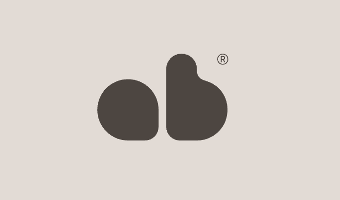
Lettermark logos, sometimes called monogram logos, reduce the brand name to its initials rendered as a unified symbol. These initial-based designs function as symbols while maintaining a connection to the actual brand name.
The Logotouse library features lettermark variations like "AB" style logos that explore different approaches to combining letters. Some stack verticals, others integrate letters into geometric containers, and some create ligatures where letters share structural elements.
Lettermarks work best for companies with long names that would be unwieldy as full wordmarks, or for established brands where the initials have become more recognizable than the full name. They offer the memorability of symbols while retaining an intuitive connection to the brand name.
Design considerations for minimalist lettermarks include letter spacing (how close or far apart the initials sit), baseline alignment (whether letters align to a common bottom line or float at different heights), and integration strategy (whether letters maintain independence or merge into a unified form).
Each subsection links to relevant examples within the Logotouse minimalist logo collection where you can explore variations and download assets for your projects.
Benefits and Limitations of Minimalist Logos
Like any design approach, minimalist logos come with clear advantages and inherent constraints. Understanding both helps you determine when this style serves your needs and when alternative approaches might work better.
Benefits
Versatile across contexts. Minimalist logos adapt to diverse applications with minimal modification. They work equally well on light backgrounds and dark backgrounds. They scale from billboard size to app icon size. They reproduce reliably in single-color applications like embroidery, engraving, or screen printing. This versatility reduces production costs and ensures consistent brand presentation across all touchpoints.
Easy to adapt. When your brand evolves, minimalist logos accommodate changes more gracefully than complex designs. Adding a new color, adjusting spacing, or refining letterforms can refresh the logo without destroying accumulated brand equity. The simplicity provides a stable foundation for iterative improvement.
Professional appearance. Clean, minimal design signals sophistication and modernity. In industries from technology to finance to healthcare, minimalist logos communicate competence and trustworthiness. The restraint implies confidence. The brand doesn't need visual tricks or decoration to command attention.
Limitations
Can feel generic if misused. The same simplicity that makes minimalist logos versatile can make them forgettable if not executed with precision. A poorly designed minimalist logo looks like a default template rather than a deliberate brand expression. The margin for error is smaller because there are fewer elements to create distinctiveness.
Less expressive if over-simplified. Brands with rich heritage, complex positioning, or emotionally-driven messaging may find pure minimalism too constraining. If your brand personality is warm, playful, or eccentric, stripping away all decorative elements might remove too much character. The challenge is finding the right level of reduction that maintains clarity without sacrificing personality.
The key to successful minimalist logos lies in understanding these trade-offs. Minimalism isn't inherently superior to other design approaches. It's a tool suited to specific contexts and objectives. Used appropriately, minimalist logos provide exceptional value. Applied indiscriminately, they can flatten brand identity into corporate sameness.
When a Minimalist Logo Is the Right Choice
Certain situations naturally favor minimalist logo approaches. Recognizing these contexts helps you make strategic decisions about visual identity early in your project.
Early-stage startups benefit enormously from minimalist logos. When you're testing product-market fit and iterating rapidly, you need a logo that won't become a bottleneck. Minimalist designs are faster to produce, easier to modify, and more forgiving of amateur execution than complex alternatives. They let you establish a professional presence without committing significant time or budget to brand development before you've validated your business model.
SaaS and tech products align naturally with minimalist aesthetics. The style reinforces associations with innovation, efficiency, and modern digital experiences. Users expect tech products to look clean and streamlined. A minimalist logo meets these expectations while ensuring your brand works perfectly in the digital environments where SaaS products live: dashboards, mobile apps, browser tabs, and product interfaces.
Personal brands for consultants, creators, and freelancers often work best with simple, name-based minimalist wordmarks. These logos put the individual's name front and center without visual distractions. They're professional without being corporate, distinctive without being gimmicky. For someone whose reputation is their primary asset, straightforward name presentation makes strategic sense.
Internal tools and MVPs require functional rather than aspirational branding. If you're building software for internal use or launching a minimum viable product to test demand, investing in elaborate logo design diverts resources from more critical activities. A clean minimalist logo provides adequate professional presentation while preserving time and budget for product development.
Pitch decks and prototypes need logos that communicate professionalism without distracting from your core message. Investors and stakeholders evaluate hundreds of presentations. A minimalist logo appears polished and credible while keeping attention on your value proposition, market opportunity, and financial projections rather than your visual identity.
In each of these scenarios, minimalist logos solve practical problems. They reduce friction, lower costs, and provide adequate visual identity without requiring extensive design expertise or resources.
Minimalist Logo Design Rules (Checklist)
Creating effective minimalist logos requires following specific principles that separate intentional simplicity from lazy reduction. Use this checklist to evaluate your design decisions.
Limit color palette. Start with black and white to ensure your logo works in the most restrictive scenario. If it's not effective in monochrome, adding color won't fix fundamental structural problems. When you do introduce color, limit yourself to 1-2 colors maximum. Every additional color adds complexity and creates reproduction challenges.
Design at smallest size first. Open your design software and create your logo at 32x32 pixels or 64x64 pixels. If it's not clearly recognizable at this size, it won't work in app icons, favicons, or social media avatars. Designing small forces you to eliminate unnecessary details and focus on bold, clear forms. You can always scale up, but you can't add detail that wasn't there from the start.
Avoid outlines, gradients, and shadows. These effects fail at small sizes and create production problems. Outlines become muddy at low resolution. Gradients require complex color reproduction and don't translate to single-color applications. Shadows add visual noise without contributing to recognition. If your logo needs these effects to be interesting, the underlying structure isn't strong enough.
Prioritize spacing and alignment. In minimalist design, negative space carries as much weight as positive forms. The space between letters, the breathing room around shapes, and the relationship between elements define the overall composition. Use a grid system. Align elements to precise measurements. Ensure optical balance even when mathematical measurements differ. Poor spacing destroys minimalist logos because there's nothing else to distract from the structural relationships.
Test across contexts. View your logo on light backgrounds and dark backgrounds. Display it at thumbnail size and billboard size. Show it to people who have never seen it before and ask what they notice first. Place it next to competitor logos and assess whether it holds its own. These tests reveal problems that aren't visible during the design process.
Be willing to iterate. Minimalist logos rarely arrive perfect in the first attempt. The process requires multiple rounds of refinement, removing elements one by one until only the essential remains. This iterative reduction is how you discover the core of the design. Rush this process and you end up with either unnecessary complexity or premature simplification.
Following these rules doesn't guarantee a great minimalist logo, but violating them almost guarantees a poor one. The rules create constraints that force better decisions and prevent common mistakes.
Using Minimalist Logos as Placeholders
The logos in the Logotouse library serve a specific purpose distinct from official brand development. Understanding this distinction helps you use these assets appropriately and legally.
These logos are intended for mockups. When you're designing a website, app interface, pitch deck, or marketing material, you often need realistic logo placement to evaluate the overall composition. Using Logotouse assets for these temporary purposes lets you develop your designs without creating custom logos for every placeholder need.
Design exploration benefits from testing different logo styles before committing to a specific direction. You might try a wordmark approach versus a symbol approach, or evaluate how different type weights affect the feel of your design. Having a library of minimalist options lets you experiment rapidly without designer costs.
Non-official use cases like student projects, portfolio pieces, or concept presentations can incorporate Logotouse logos to add polish without implying you're representing actual brands. The logos provide realistic visual presence while clearly being placeholder assets rather than real company marks.
It's critical to clarify they are not official brand marks. You cannot use Logotouse logos as your actual company logo for commercial purposes. They're not custom-designed for your specific brand positioning. Multiple other users have access to the same assets. While they're perfect for exploration and temporary use, your final brand identity should be either custom-designed or properly licensed.
This distinction between placeholder use and official branding protects both creators and users. Logotouse provides valuable resources for the design process without creating legal complications or brand ownership issues. When you're ready to launch officially, invest in custom logo development or properly licensed brand assets that you control exclusively.
The value of placeholder logos lies in reducing friction during the creative process. They let you focus on layout, messaging, and user experience while deferring final brand decisions until you have more information about your market positioning and visual needs.
The Future of Minimalist Logo Design
Minimalist design continues evolving as new technologies and platforms emerge. Several trends are reshaping how minimalist logos function in contemporary branding.
Responsive logos adapt their complexity based on context. A logo might display as a full wordmark on desktop websites but automatically simplify to a lettermark or symbol in mobile apps and social media avatars. This contextual flexibility extends minimalist principles beyond single static designs into dynamic systems.
Dark mode optimization requires logos designed to work on both light and dark backgrounds without modification. While traditional minimalist logos often defaulted to black on white, modern implementations need equal sophistication in white on black. This drives even more reduction to ensure clarity in both contexts.
Motion and animation are becoming standard in digital brand applications. Minimalist logos lend themselves to subtle animations that reinforce brand personality, from loading states to transition effects to interactive responses. The simplicity makes the motion more readable and less distracting.
AI and procedural generation are beginning to influence logo design workflows. While AI can't yet create truly strategic brand identities, it can generate variations on minimalist themes rapidly, helping designers explore options and iterate faster. This technology will likely augment human creativity rather than replace it, particularly for placeholder and prototype use cases.
The core principles of minimalist logo design remain constant: reduction, clarity, scalability, and timelessness. But the execution of these principles continues adapting to new technologies, platforms, and user expectations. Successful minimalist logos balance foundational design principles with contemporary application requirements.
Conclusion
Minimalist logos represent more than an aesthetic preference. They're a strategic response to how brands function in digital-first environments where clarity and scalability determine success.
The most effective minimalist logos result from intentional reduction rather than arbitrary simplification. Every element that remains serves a purpose. Every element removed was carefully considered and consciously eliminated. This discipline produces designs that work harder with less visual information.
Whether you choose a minimalist wordmark, symbol, or lettermark depends on your specific context, audience, and objectives. Early-stage startups and digital products naturally align with minimalist approaches. Brands requiring rich emotional expression or complex positioning may need different solutions.
The Logotouse library provides minimalist logo assets designed specifically for mockups, prototypes, and design exploration. These placeholder logos help you develop your visual systems without creating custom assets for every temporary need. Browse the full collection of colored logos, black variations, and white options to find assets that support your design process.
Minimalist design isn't inherently superior to other approaches. It's a tool suited to specific contexts. Understanding when to use it and how to execute it effectively separates professional brand development from generic template application. The difference lies in the details: spacing, proportion, optical balance, and strategic reduction.
As digital platforms continue fragmenting into smaller screens and more diverse contexts, minimalist logo design principles will only become more relevant. Brands that prioritize clarity and scalability today are building visual systems that remain effective tomorrow.
Read more
Subscribe to get fresh stories, tips, and logo resources delivered straight to your inbox.