Logo Styles
|
Feb 9, 2026
Wordmark vs Symbol Logos: Differences, Examples, and When to Use Each
Choosing between a wordmark and a symbol logo isn't about picking the "better" option. There is no universal winner in the wordmark vs symbol logos debate. The right choice depends entirely on your brand stage, the strength of your name, and where your logo will appear most often.
Choosing between a wordmark and a symbol logo isn't about picking the "better" option. There is no universal winner in the wordmark vs symbol logos debate. The right choice depends entirely on your brand stage, the strength of your name, and where your logo will appear most often.
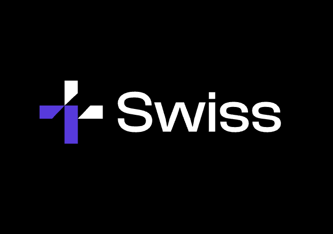
A wordmark logo uses typography to spell out your brand name. Think Google, Coca-Cola, or FedEx. The logo is the name, styled in a distinctive way.
A symbol logo relies on an icon or mark to represent your brand visually. Apple's apple, Nike's swoosh, and Twitter's bird (now X's letter mark) are all symbols that communicate brand identity without spelling anything out.
Some brands use only one type. Others use both as part of a larger logo system. Understanding the differences between these two fundamental logo types will help you make a strategic choice that supports your brand's growth and recognition.
What Is a Wordmark Logo?
A wordmark logo (also called a logotype or text logo) is a typography-based design that uses styled lettering to represent a brand name. There are no icons, symbols, or graphic elements beyond the letterforms themselves.
The power of a wordmark lies in its clarity and immediate name recognition. When someone sees a wordmark, they know exactly what the brand is called. There's no guessing, no visual interpretation required.
Why Wordmark Logos Work
Wordmarks excel when:
Brand name recognition is the priority. If your company name is new, unfamiliar, or difficult to pronounce, a wordmark helps people learn it quickly. The logo literally teaches people what to call you.
The name itself has meaning. Names like "Spotify," "Netflix," or "Mailchimp" describe or suggest what the service does. A wordmark reinforces this connection.
You want design flexibility through typography. Different fonts communicate different brand personalities. Research shows that color can increase brand recognition by up to 80%, and typography works similarly. Serif fonts feel traditional and authoritative. Sans-serif fonts feel modern and clean. Script fonts feel elegant or casual depending on the style.
Wordmark Logo Examples
Many successful brands rely exclusively on wordmarks:
Geographic and location-based brands often use wordmarks because the name itself carries meaning. City names, regional brands, and place-based businesses benefit from wordmark clarity.
Professional service firms like consulting agencies, law firms, and financial services companies frequently choose wordmarks. The straightforward presentation signals trustworthiness and professionalism.
Consumer brands with distinctive names use wordmarks to build name recognition. Brands like Visa, Sony, Canon, and Disney have transformed their wordmarks into globally recognized assets.
You can explore hundreds of minimalist wordmark options across different styles and industries, available as placeholder assets while you develop your brand identity.
What Is a Symbol Logo?
A symbol logo (sometimes called a brandmark or logo mark) uses an icon, shape, or graphic element to represent a brand without spelling out its name. The symbol becomes the visual shorthand for everything the brand represents.
Symbol logos can be literal or abstract. A literal symbol directly represents what a company does (a house for real estate, a leaf for organic products). An abstract symbol uses shapes, colors, and forms to create associations and feelings without depicting anything specific.
Why Symbol Logos Work
Symbols excel when:
The brand is already established. Once people know your name, a symbol can represent it more efficiently. Nike doesn't need to write "Nike" because the swoosh alone triggers instant recognition.
Visual impact matters more than literal meaning. Symbols can convey emotion, movement, and values in ways that text cannot. The bold simplicity of a well-designed symbol creates strong visual memory.
Space is limited. App icons, social media avatars, and small-format applications work better with compact symbols than with stretched-out wordmarks.
Symbol Logo Categories
Symbol logos fall into several categories:
Abstract symbols use geometric shapes and forms to create unique marks. Think of the Pepsi circle, the Adidas stripes, or the Chase Bank octagon. These shapes don't literally depict anything, but they become strongly associated with their brands.
Literal icons show recognizable objects or concepts. A camera for a photography app, a shopping cart for an e-commerce platform, or a chat bubble for a messaging service.
Conceptual symbols represent ideas rather than physical things. A lightbulb for innovation, an upward arrow for growth, or connecting nodes for networking.
Browse symbol-based logo designs to see how different visual approaches work across industries and applications.
Pros and Cons of Wordmark Logos
Advantages of Wordmark Logos
1. Clear brand naming
There's zero ambiguity about what your brand is called. This matters enormously in the early stages when you're building awareness from scratch. Every time someone sees your logo, they're also learning or reinforcing your brand name.
2. Easy to understand and remember
People don't need to decode meaning or make associations. The logo is the name, and the name is the logo. This directness makes wordmarks accessible to all audiences.
3. Strong for early-stage brands
Startups, new product launches, and emerging businesses benefit from the name-building power of wordmarks. You're not yet famous enough for a symbol alone to work.
4. Typography creates personality
Font choice, letter spacing, weight, and style all contribute to brand personality. Research on typography and brand perception demonstrates that typeface choices significantly influence consumer emotions and brand associations. Playful brands can use rounded, bouncy fonts. Serious brands can use sharp, authoritative typefaces.
5. Easier to trademark
In many jurisdictions, wordmarks that use standard or modified typography are somewhat easier to trademark than purely abstract symbols, because they combine the distinctive element (the specific design) with the brand name itself.
Disadvantages of Wordmark Logos
1. Less compact format
Text takes up more space than a symbol, especially if your brand name is long. This creates challenges in square formats like app icons, social media avatars, and favicon spaces.
2. Weaker performance as app icons
On a smartphone screen, a wordmark logo compressed into a tiny square often becomes illegible. The text turns into indistinct shapes that fail to communicate anything.
3. Less versatile across different contexts
Wordmarks work beautifully on horizontal spaces like websites headers and business cards. They struggle in circular, square, or vertical applications where the text proportions don't fit naturally.
4. Harder to scale to very small sizes
Intricate typography with thin lines, small counters (the enclosed spaces in letters like 'o' or 'a'), or delicate serifs can become muddy or disappear entirely when scaled down.
5. Language and localization challenges
If you operate globally, your wordmark may need to be redesigned or adapted for different writing systems. A symbol can remain consistent across all markets.
Pros and Cons of Symbol Logos
Advantages of Symbol Logos
1. Extremely compact
A well-designed symbol fits perfectly into any shape: square, circle, or custom silhouette. This makes symbols ideal for app icons, where space is strictly limited and every pixel matters.
2. Icon-friendly for digital platforms
Modern branding exists across dozens of digital touchpoints. Social media profiles, browser favicons, mobile apps, and smart device interfaces all favor compact, recognizable symbols.
3. Strong visual recall
Humans are wired to remember images more effectively than text. A distinctive symbol creates a powerful visual memory that persists longer and triggers faster recognition than typography alone.
4. Works without language
Symbols transcend language barriers. The same mark works in Tokyo, New York, Mumbai, and São Paulo without translation or adaptation. This universal quality is invaluable for global brands.
5. Timeless and flexible
Good symbol logos age well. While typographic trends change over time, a strong symbol can remain relevant for decades with minimal updates. Think of the Shell logo, the Mercedes star, or the CBS eye.
Disadvantages of Symbol Logos
1. Requires existing brand recognition
A symbol means nothing until people learn what it represents. For new brands, this creates a significant hurdle. You'll need to invest considerable time and resources building the association between your symbol and your name.
2. Can feel abstract or unclear initially
What does the Nike swoosh mean if you don't know it represents Nike? Without context, many symbols appear arbitrary. Early-stage brands using symbols must pair them with wordmarks until recognition develops.
3. Harder to design effectively
Creating a truly distinctive symbol that's simple enough to work at any size, unique enough to stand out, and meaningful enough to connect with your brand values is extraordinarily difficult. Poor symbol design looks generic.
4. Requires supporting materials
During your brand's growth phase, you'll likely need business cards, presentations, and marketing materials that include both your symbol and your name in text. This dual requirement adds complexity.
5. Risk of similarity to existing symbols
With millions of businesses worldwide, the chances of unintentionally creating a symbol similar to another brand's mark are higher than you might think. This creates potential trademark conflicts.
Which Logo Type Should You Choose?
The decision between a wordmark and a symbol isn't arbitrary. Specific business factors should guide your choice.
Choose a Wordmark Logo If:
You're launching a new brand or startup. In the early stages, name recognition is your primary goal. A wordmark logo explicitly teaches people what to call you with every brand exposure.
Your brand name is distinctive and memorable. If you've invested in a unique name that communicates something about your value proposition, display it proudly in your logo.
You're building a personal brand. Professionals, consultants, creators, and service providers often benefit from wordmark logos that emphasize their names.
Your name is short (1-2 words, 12 letters or fewer). Compact names work beautifully as wordmarks because they maintain legibility even at smaller sizes.
You operate in professional services. Legal firms, consulting agencies, financial advisors, and B2B service providers often use wordmarks to project professionalism and clarity.
Choose a Symbol Logo If:
You're creating an app-first product. Mobile applications require strong app icons. A symbol logo translates perfectly into the square icon format that appears on every user's home screen.
Your brand name is long or complex. If your company name has 3+ words or 15+ letters, a symbol provides a more compact alternative for many applications.
You've already established brand recognition. If customers already know your name, a symbol can reinforce your brand more efficiently than repeating your name in every application.
You want to emphasize values over naming. Some brands use symbols to represent concepts (innovation, trust, growth) that matter more to their positioning than their literal names.
You're planning global expansion. Symbols work universally across languages and cultures, simplifying international brand consistency.
The Practical Checklist
Use this framework to evaluate your specific situation:
- Brand age: New (< 2 years) → Wordmark | Established → Symbol
- Name length: Short → Wordmark | Long → Symbol
- Primary platform: Website/print → Wordmark | App/mobile → Symbol
- Budget for brand building: Limited → Wordmark | Substantial → Symbol
- Geographic scope: Local/regional → Wordmark | Global → Symbol
- Industry norms: Look at category leaders and consider whether differentiation or alignment serves you better
For many brands, especially in the MVP or prototype stage, starting with a clean placeholder logo from either category allows you to test your concept without committing to expensive custom design work.
Using Both in a Logo System
You don't have to choose just one logo type forever. Many successful brands use both wordmarks and symbols as part of a comprehensive logo system.
Primary and Secondary Logos
A complete brand identity typically includes:
Primary logo: Your main representation, used in most contexts. This might be your wordmark with a small symbol, or a standalone symbol if you're established enough.
Secondary logo: An alternative version for different applications. If your primary is a horizontal wordmark, your secondary might be a stacked version or a symbol that works in square formats.
Logo variations: Different configurations for different backgrounds (colored logos for white backgrounds, white logos for colored backgrounds, black logos for general use).
The Logotouse library offers multiple variations of each logo concept, allowing you to test how different approaches work across your applications before investing in custom design.
Responsive Logo Systems
Modern brands need logos that adapt to different contexts:
Large format (website headers, signage): Full wordmark with symbol
Medium format (business cards, email signatures): Wordmark only or symbol with short name
Small format (app icons, social media avatars, favicons): Symbol only
This responsive approach ensures your brand remains recognizable and legible regardless of where it appears or how much space is available.
Evolution From Wordmark to Symbol
Many famous brands began with wordmarks and gradually transitioned to symbol-focused identities as recognition grew:
Apple started with a detailed illustrative logo, moved to a wordmark, and eventually settled on just the apple symbol. Today, the word "Apple" rarely appears in their branding because the symbol alone suffices.
Starbucks used to feature both their siren symbol and the "Starbucks Coffee" wordmark. As the brand became globally recognized, they dropped the text entirely, letting the symbol stand alone.
Target uses both its bullseye symbol and wordmark, but the symbol has become so recognizable that it often appears alone in advertising and packaging.
This evolution typically takes 5-10 years and requires consistent application across thousands of brand touchpoints. Not every brand reaches this level of recognition, but understanding the potential path helps you plan your visual identity strategy.
The advantage of planning for this evolution from the beginning is that you can design your wordmark and symbol to work together cohesively, even if you primarily use one or the other at any given time.
Placeholder Logo Examples on Logotouse
Before committing to expensive custom logo design, many founders and product teams use placeholder logos to test their brand identity in context. Logotouse provides exactly this resource.
Testing Both Logo Types
The platform offers:
Wordmark options in various typographic styles: Modern sans-serif, classic serif, geometric, rounded, condensed, and expanded letterforms that work across different brand personalities.
Symbol options across conceptual categories: Abstract shapes, literal icons, nature-inspired marks, technology symbols, and geometric patterns that can represent diverse industries.
Multiple color treatments: Every logo is available in colored, black, and white versions, allowing you to see how each design works against different backgrounds and in different contexts.
Using Placeholder Logos Strategically
Placeholder logos serve several practical purposes:
MVP and prototype testing: Launch your product with a professional-looking identity without spending thousands on custom design before validating your concept.
Client presentations: Designers and agencies can show clients how different logo approaches (wordmark vs symbol) would work in their specific applications.
Internal alignment: Get your team aligned on visual direction before engaging a designer. Test different approaches in your actual materials to see what resonates.
Investor decks and early marketing: Create polished presentations and landing pages that look professional while you're still refining your brand strategy.
The key insight is that you can download and test both wordmark and symbol approaches before making a final decision. See how each type works in your website header, your app mockup, your business cards, and your social media profiles. This real-world testing reveals practical considerations that pure theory can't capture.
When to Transition to Custom Design
Placeholder logos work well for early-stage brands, but most companies eventually invest in custom design:
After product-market fit: Once you've validated your concept and have real customers, custom branding helps you stand out in your specific market.
Before major fundraising: If you're raising significant capital, a custom identity signals professionalism and commitment to potential investors.
During major pivots: If your brand positioning or target audience changes substantially, update your visual identity to match.
When category leadership is the goal: Market leaders need distinctive identities that own specific visual territories in their customers' minds.
Until these transitions occur, placeholder logos from services like Logotouse provide everything you need to present your brand professionally across all touchpoints.
Making Your Decision: Wordmark vs Symbol
The wordmark vs symbol decision ultimately comes down to three core questions:
1. How well known is your brand name right now?
New brands need wordmarks to build name recognition. Established brands can leverage symbols for compact, efficient representation.
2. Where will your logo appear most often?
If your primary touchpoint is a mobile app, favor symbols. If you're mainly visible through web presence, presentations, or print, wordmarks work beautifully.
3. How long is your brand name?
Short names (1-2 words) work well as wordmarks. Longer names become unwieldy and benefit from symbol alternatives.
Beyond these practical considerations, remember that logo type is just one element of your brand identity. Consistency in application matters more than choosing the theoretically "perfect" logo type. A well-executed wordmark applied consistently beats an inconsistently used symbol every time.
Your Next Steps
Ready to explore both options?
Start by browsing the colored logo collection to see how different wordmark and symbol approaches work across industries. Then check the black and white variations to ensure your chosen direction works in all contexts.
Remember: you're not making a permanent, unchangeable decision. Many brands evolve their logo systems over time as their recognition grows and their needs change. Start with what works for your current stage, test it in real applications, and refine as you scale.
The best logo is the one that serves your brand's specific needs right now, not the one that follows a universal rule. Whether you choose a wordmark, a symbol, or a combination of both, commit to consistent application across all touchpoints. That consistency builds the recognition that makes any logo type successful.
Read more
Subscribe to get fresh stories, tips, and logo resources delivered straight to your inbox.