
Company and Brand Logos
|
Feb 19, 2026
Brand Logo Guidelines Designers Should Know
Every professional brand has a logo. But a logo without rules is just a pretty picture waiting to be broken. Brand logo guidelines are what keep a logo consistent across hundreds of touchpoints, from a business card to a billboard, from a social media avatar to an embroidered cap.
Brand Identity Logo Design Design Systems
Every professional brand has a logo. But a logo without rules is just a pretty picture waiting to be broken. Brand logo guidelines are what keep a logo consistent across hundreds of touchpoints, from a business card to a billboard, from a social media avatar to an embroidered cap.
For designers, understanding these rules is not optional. It is the baseline expectation. Whether you are working with a client's existing brand or helping build one from scratch, ignoring logo guidelines leads to visual inconsistency, weakened brand recognition, and sometimes real legal consequences.
This guide focuses entirely on execution. No branding theory. No abstract principles. Just the practical rules you need to apply logo guidelines correctly, across digital, print, and everything in between.
What are brand logo guidelines?
Brand logo guidelines are the documented rules that define how a logo can and cannot be displayed. They control spacing, size, color usage, background placement, and file formats to ensure visual consistency across every application.
Brand logo guidelines are the documented rules that define how a logo can and cannot be displayed. They control spacing, size, color usage, background placement, and file formats to ensure visual consistency across every application.
Consistent brand presentation across all platforms has been shown to increase revenue by an average of 23%. Logo guidelines are the first line of defense for achieving that consistency.
What Brand Logo Guidelines Typically Include
Most professionally produced logo guideline documents cover a predictable set of sections. If you are handed a brand guide, here is what you should expect to find inside:
- Primary and secondary logo versions
- Clear space and exclusion zones
- Minimum size requirements (digital and print)
- Color specifications (Pantone, CMYK, RGB, HEX)
- Background control rules
- Logo lockups (logo paired with tagline, division names, etc.)
- Placement and alignment rules
- Approved file format specifications
- Misuse examples showing what never to do
Not every brand document includes every section. Smaller brands may have a one-pager. Enterprise brands may have a 100-page PDF. Either way, the categories above are what you will most commonly encounter, and what we will walk through in detail.
Logo Versions and Lockups
A well-designed logo system is not just one file. It is a family of approved variations, each built for a specific use case. Understanding which version to use, and when, is one of the most fundamental skills in applying brand logo guidelines correctly.
The standard logo versions
- Primary logo: The main, full version. Used by default in most contexts. Includes the icon and wordmark together.
- Secondary variation: An alternate arrangement, often used when space constraints make the primary impractical.
- Icon-only mark: The symbol without the wordmark. Used for favicons, app icons, social avatars, and embossed applications.
- Wordmark-only version: The brand name without the symbol. Used where the symbol may not reproduce clearly.
- Horizontal vs stacked layout: Different spatial arrangements for wide or tall containers.
For a deeper understanding of how wordmarks differ from symbol-based logos, see this guide on wordmark vs symbol logos.
Key execution rules for logo versions
Never switch versions arbitrarily. Each version exists for specific spatial or technical conditions. If you are designing a wide header banner, use the horizontal layout. If you are designing a small circular social avatar, use the icon-only mark.
Proportions must never be adjusted. The relationship between the icon and the wordmark, or between letterforms within the wordmark, is locked. Scaling the logo up or down uniformly is fine. Stretching it horizontally or compressing it vertically is a violation.
Alignment integrity also matters. If a logo is positioned alongside other brand elements like a tagline or division name, that spatial relationship must match what the guidelines specify. These combined arrangements are called logo lockups, and altering the spacing inside a lockup is treated as misuse.
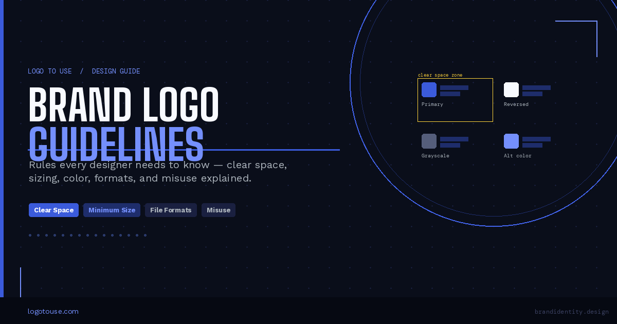
Clear Space Rules Explained
Clear space (also called an exclusion zone) is the protected empty area that must surround the logo at all times. No text, no other graphics, no decorative elements can enter this zone.
The purpose is straightforward: give the logo room to breathe so it remains visually distinct and readable, regardless of what surrounds it.
How clear space is calculated
Different brands use different reference units. The two most common methods are:
Method 1: Based on a letter height from the wordmark. The height of a specific letter, usually a capital letter like "X" or the brand's first initial, is used as the spacing unit. If the letter is 20px tall, the clear space on all four sides is 20px.
Method 2: Based on a unit from the icon or symbol. A specific measurement derived from the icon itself, often the width of a shape or stroke within the mark, becomes the spacing unit. This is common in icon-heavy identities.
Implementation tips
- Use your layout grid. Align the exclusion zone to grid columns or baseline grids so spacing is consistent across the document.
- In design systems, create spacing tokens that reflect the logo's clear space unit. This ensures any designer on the team applies the correct value automatically.
- When the logo appears inside a component, like a navigation bar or a card header, lock the spacing inside the component itself rather than relying on each designer to remember the rule.
If you work in Figma, the guide on how to use logos in Figma covers how to set up constraints and auto-layout to enforce clear space automatically.
Common clear space mistakes
- Crowding the logo with body text or headlines that visually compete with it
- Placing the logo inside a tight container (like a button) where the exclusion zone cannot be respected
- Ignoring clear space in social media graphics, where templates often push elements too close together
Minimum Size Requirements
Every logo has a minimum size below which it should not be used. Below that threshold, fine details, wordmarks, and taglines become illegible. Forcing a logo into a too-small space does not just look bad — it actively damages brand recognition.
Digital considerations
For screens, minimum size is usually expressed in pixels. Common guidelines specify values like 80px wide for the primary logo and 24px for an icon-only mark. Key digital contexts to plan for include:
- Mobile interfaces: Headers and navigation bars often allow only 40 to 60px of height. Use the horizontal or icon-only version.
- Social media thumbnails: Profile images (typically 400x400px displayed at 50px) almost always require the icon-only mark.
- App icons: These must work at sizes as small as 16x16px. Only the icon mark survives at this scale.
Print considerations
In print, minimum size is expressed in millimeters or inches. The logo must remain legible after production, accounting for dot gain in offset printing or material absorption in screen printing. Common minimum print sizes are:
- Business cards: Primary logo typically no smaller than 20mm wide
- Merchandise and promotional items: Varies widely by application method
- Embroidery: Fine wordmark details rarely survive below 30mm; switch to icon-only
- Signage: Scale depends on viewing distance, not just physical dimensions
Accessibility note: If text within the logo becomes unreadable at the required size, do not shrink further. Instead, switch to an alternate approved version (icon-only, simplified mark) that is designed for small-scale use.
Logo Color Variations and Background Rules
A brand's logo should look correct whether it appears on a white background, a dark navy surface, a colored photograph, or a printed envelope. That is why most logo systems include multiple color variations, each approved for specific contexts.
The four standard color versions
- Full color version: The primary version. Used on white or light neutral backgrounds where brand colors display accurately.
- Single-color version: One ink, one color. Used in contexts where color printing is not available or practical (receipts, embossed labels, single-ink merchandise).
- Reversed version: The logo in white or light colors, designed for use on dark backgrounds. Often available in dark navy, black, or deep brand-colored backgrounds.
- Grayscale version: Used in black-and-white print media or when color fidelity cannot be guaranteed.
You can browse categorized logo assets, including colored logo files, black logo files, and white logo files, on Logo To Use.
Contrast and legibility
Background control rules exist because contrast determines legibility. WCAG 2.1 recommends a minimum contrast ratio of 4.5:1 for text and 3:1 for logos and graphical elements. When in doubt, check the contrast before placing a logo on a colored or photographic background.
Rule: Do not introduce outlines, drop shadows, gradients, or glow effects around or on the logo unless those effects are explicitly included in the approved guidelines. These additions distort the logo's appearance and undermine brand consistency.
Logo Placement and Alignment Rules
Where a logo sits on a page matters as much as how it looks. Placement rules define consistent margin behavior, alignment relationships with other elements, and the spatial logic that gives a brand its visual order.
Common placement principles
- Margin positioning: Logos in headers or footers are typically anchored to a consistent margin offset, not floating freely inside the space.
- Corner placement: Many brands specify top-left as the default position for the primary logo in documents and marketing materials, mirroring natural reading direction.
- Baseline alignment with typography: When a logo appears alongside a headline or navigation links, align the bottom of the logo or wordmark to the text baseline for visual coherence.
- Center alignment: Acceptable in certain contexts (email signatures, print ads, title pages) but should follow the guidelines rather than personal preference.
Do and do not rules for placement
- Maintain consistent margins across all applications
- Align the logo to the layout grid
- Preserve clear space in all directions
- Use the correct version for the available space
- Center the logo arbitrarily without checking guideline alignment specifications
- Crop the logo at the edge of a container or image
- Place the logo on low-contrast or visually busy imagery where it disappears
- Overlap the logo with other logos, patterns, or decorative elements
Placement also comes up frequently in presentation design. If you create slide decks, see the full guide on using logos in PowerPoint for positioning best practices in that context.
Logo File Formats Designers Should Request
File format is not a minor technical detail. It is the difference between a logo that scales perfectly on a 6-foot banner and one that turns into a blurry mess. Knowing which format to request and when to use it is a core professional skill.
| Format | Type | Best For | Transparency |
|---|---|---|---|
| SVG | Vector | Web, scalable UI, responsive design | Yes |
| PNG | Raster | Digital use with transparent background | Yes |
| Vector | Professional print workflows | Yes | |
| EPS | Vector | Legacy print and press workflows | Yes |
| JPG | Raster | Only when transparency is not needed | No |
For a deeper breakdown of which format works best for websites and digital platforms, see the guide on best logo formats for websites: SVG, PNG, JPG explained. If you are dealing with legacy print files, the EPS logo files explained guide is worth reading too.
Export checklist
- Use a transparent background for PNG, SVG, EPS, and PDF exports whenever possible
- Export in the correct color profile: RGB for digital (sRGB standard), CMYK for professional print
- Follow consistent naming conventions:
brandname-logo-primary-rgb.svgis cleaner thanlogo_final_v3_USE THIS ONE.png - Always export at 2x or 3x resolution for raster files destined for high-DPI screens
Common Logo Misuse Examples
Most brand guidelines include a misuse section. It is not there to be punitive. It is there because the most common violations are unintentional, and showing what looks wrong is often more instructive than only showing what looks right.
Here are the violations you will see most often, and why they each matter:
- Stretching or squashing the logo: Distorts proportions and makes the brand look amateurish. Always scale proportionally.
- Changing brand colors: A logo in the wrong color communicates the wrong brand. It also defeats the purpose of having approved color specifications.
- Adding drop shadows, glows, or gradients: These effects were not part of the original design and visually complicate the mark. They usually make it look dated.
- Rotating or skewing the logo: Logos are designed to be read at a fixed orientation. Tilting them disrupts readability and looks unintentional.
- Rebuilding the typography: Replacing the wordmark's custom or licensed typeface with a system font changes the character of the brand entirely.
- Placing on busy or low-contrast imagery: The logo becomes unreadable, and the brand loses visual presence in the exact moment it should be communicating clearly.
- Altering spacing inside lockups: Moving the tagline or adjusting the icon-to-wordmark gap breaks the designed relationships and looks like a mistake.
- Combining with unapproved graphics: Pairing the logo with a competing symbol, pattern, or icon that was not designed to work alongside it creates visual confusion.
Understanding misuse is also key to knowing when simpler logo types prevent these problems from arising. The guide on minimalist logos explained covers why reduction in logo complexity often increases misuse resilience.
How Designers Should Operationalize Logo Guidelines
Reading a brand guide is the beginning, not the end. The real value comes from building systems and habits that make following those guidelines automatic, so the right choices happen by default rather than by constant vigilance.
Practical action steps
- Create logo components in your design tool. In Figma, Sketch, or Adobe XD, build locked components for each approved logo version. This means other team members cannot accidentally edit the logo when using your templates.
- Lock proportions in every instance. Set constraints that preserve aspect ratio so no one can stretch the logo without breaking the component.
- Define spacing tokens. If your design system uses tokens for spacing values, create a dedicated token for the logo's clear space unit. Label it clearly so its purpose is obvious.
- Create export presets. In Figma or Illustrator, save export settings (format, resolution, color profile) as presets tied to the logo component so exports are always consistent.
- Build a one-page internal quick reference. Distill the most critical rules, approved versions, color codes, and minimum sizes onto a single sheet. Share it with every team member who touches the brand. Make it the first thing a new hire sees.
Building these habits into your workflow is what separates designers who occasionally follow guidelines from those who embed them into every project by default.
Copy-Paste Designer Checklist
Before any logo-containing design goes to a client, into production, or onto a platform, run through this checklist:
- Correct logo version used for this context (primary, secondary, icon-only, wordmark)
- Clear space applied on all four sides per guidelines
- Minimum size respected for the output medium (digital or print)
- Contrast verified against the background (minimum 3:1 for graphical elements)
- No unauthorized color modifications applied
- No added effects (shadows, outlines, gradients, glows)
- Proportions locked (no stretching or squashing)
- Correct file format exported for the intended use
- Transparent background confirmed where required
- File naming convention consistent with brand standards
Frequently Asked Questions
What are brand logo guidelines?
Brand logo guidelines are documented rules that define how a logo must appear across digital and print materials. They protect consistency by specifying spacing, size limits, color use, background rules, and approved file formats. Without these rules, a logo will appear differently across applications, weakening the brand over time.
Why do logos have clear space rules?
Clear space ensures the logo remains readable and visually distinct. Without a protected zone around it, surrounding elements can reduce its visual impact, create cluttered compositions, and weaken brand recognition. Clear space is what gives the logo authority within a layout.
What happens if logo guidelines are ignored?
Ignoring guidelines leads to visual inconsistency, distorted logos, and reduced trust. Over time, inconsistent logo use dilutes brand recognition and can cost a brand significant revenue compared to those that maintain visual consistency.
What is the minimum size for a logo?
Minimum size depends on the brand and medium. For digital, guidelines typically specify pixel widths (often 80px for the primary logo, 24px for icon-only). For print, minimum sizes are expressed in millimeters. If legibility fails at the required size, switch to an alternate approved version rather than shrinking further.
Which logo file format is best?
Vector formats like SVG or EPS are best for scalability and should be your default request. PNG works for digital use with a transparent background. JPG should only be used when transparency is unnecessary, such as a logo on a solid white background. Never use JPG for a logo that needs to sit on a colored or photographic surface.
Can a logo be recolored?
Only if an approved color variation is explicitly provided in the guidelines. Designers should not create new color versions, apply brand colors from other elements to the logo, or use hex values not specified in the brand document. Unapproved recoloring is one of the most common and most damaging forms of logo misuse.
Why are logo misuse examples included in guidelines?
Misuse examples prevent common mistakes like stretching, recoloring, or adding visual effects. Showing what incorrect use looks like is often more instructive than only showing correct use. It also sets clear expectations for clients, contractors, and internal teams who may not have formal design training.
What is a logo lockup?
A logo lockup is a pre-approved, fixed combination of logo elements used together, such as the primary mark paired with a tagline, a division name, or a partner brand's logo. The spacing and proportions inside a lockup are fixed and must not be altered. Using a lockup correctly maintains the visual relationships the original designer intended.
Read more
Subscribe to get fresh stories, tips, and logo resources delivered straight to your inbox.


