Logo Use Cases
|
Feb 12, 2026
Using Logos in PowerPoint: Complete Design Guide
Using logos in PowerPoint presentations is essential for maintaining brand consistency and creating professional, visually cohesive slide decks. Whether you're designing a corporate pitch deck, client presentation, or internal report, proper logo implementation can significantly impact how your audience perceives your brand.
Using logos in PowerPoint presentations is essential for maintaining brand consistency and creating professional, visually cohesive slide decks. Whether you're designing a corporate pitch deck, client presentation, or internal report, proper logo implementation can significantly impact how your audience perceives your brand. This comprehensive guide covers everything from file format selection to advanced placement techniques, ensuring your presentations maintain visual credibility across all platforms.
According to research from the Nielsen Norman Group, visual hierarchy and consistent branding elements improve information retention by up to 47% in presentation contexts. When logos are properly integrated, they reinforce brand messaging without overwhelming the content, striking the delicate balance between visibility and subtlety.
Why Using Logos in PowerPoint Matters
Brand recognition in presentations extends far beyond simple aesthetics. When you consistently display your logo across presentation slides, you create psychological anchoring that helps audiences associate specific visual markers with your organization's values and messaging.
Visual credibility plays a crucial role in stakeholder perception. A study from the Stanford Web Credibility Research found that 75% of users make judgments about a company's credibility based on visual design elements, with logo presence and quality being primary factors.
Corporate identity consistency matters more than ever in multi-platform environments. When your presentation appears in email attachments, projection screens, PDF exports, and mobile devices, maintaining logo clarity across these contexts becomes critical. Professional presentations require logos that scale appropriately, maintain resolution, and align with official brand guidelines regardless of viewing conditions.
Need high-quality logo files for your presentations? Explore thousands of professionally designed options at LogoToUse, where you'll find colored logos, black logo variations, and white logos optimized for presentation use.
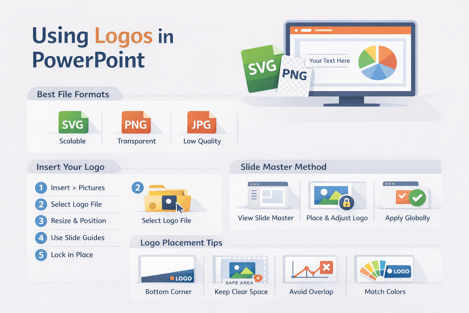
Best Logo File Formats for PowerPoint
File format selection dramatically affects how your logo renders in PowerPoint. Microsoft PowerPoint supports multiple image formats, but not all formats perform equally when it comes to scaling, transparency, and cross-platform compatibility.
SVG vs PNG vs JPG in Presentations
SVG (Scalable Vector Graphics) represents the gold standard for PowerPoint logos. Unlike raster formats, SVG files use mathematical equations to define shapes, meaning they scale infinitely without quality loss. When you zoom into an SVG logo at 400% magnification, every curve and line remains perfectly crisp.
Key SVG advantages:
• Infinitely scalable without pixelation - perfect for large projection screens or detailed handouts
• Smaller file sizes compared to high-resolution raster images, keeping presentation files lightweight
• Native editing capabilities in PowerPoint's newer versions (2016+), allowing color changes without external software
• Transparency support that works consistently across different slide backgrounds
PNG (Portable Network Graphics) files serve as the reliable fallback option. PNG format excels in one critical area: transparency support. When your logo requires transparent backgrounds to overlay colored slides, PNG delivers consistent results across all PowerPoint versions, including legacy installations.
For optimal PNG performance, use resolution guidelines based on your intended display size. A logo spanning 2 inches on screen should be saved at 600 x 600 pixels minimum to maintain clarity on modern high-DPI displays. Learn more about format optimization in our detailed guide on best logo formats for websites.
JPG (JPEG) limitations make this format less suitable for logo work. JPG compression introduces artifacts around sharp edges, creating visible halos around text and geometric shapes. Additionally, JPG cannot support transparency, forcing logos onto solid rectangular backgrounds that often clash with slide designs.
Format recommendation hierarchy: Use SVG whenever possible, fall back to PNG for compatibility concerns, and avoid JPG entirely for logo applications.
When to Use EPS Logo Files
EPS (Encapsulated PostScript) files represent the professional standard for print design but require conversion before PowerPoint use. PowerPoint cannot natively import EPS files, creating a workflow challenge for designers transitioning from print to presentation media.
Vector editing before importing becomes necessary when you receive brand assets exclusively in EPS format. Professional design software like Adobe Illustrator can open EPS files, allowing you to modify colors, remove unwanted elements, or adjust proportions before exporting to PowerPoint-compatible formats.
Converting EPS to SVG or PNG requires specialized tools. For SVG conversion, Adobe Illustrator provides the cleanest output with "Save As > SVG" maintaining all vector properties. Alternatively, online converters like CloudConvert handle basic conversions, though complex logos may lose subtle details during translation.
For PNG conversion from EPS, export at 300 DPI minimum to ensure sufficient resolution for presentation purposes. Set dimensions based on your largest anticipated logo size, then downsize in PowerPoint rather than risk upscaling pixelated images. Dive deeper into EPS file handling in our comprehensive EPS logo files explained guide.
How to Insert a Logo in PowerPoint
Inserting a logo in PowerPoint requires precision to maintain image quality and positioning consistency. Follow this step-by-step process for professional results:
1. Open PowerPoint and navigate to the specific slide where you want to place your logo. If you're adding a logo to appear across multiple slides, skip to the Slide Master section below for a more efficient workflow.
2. Go to Insert > Pictures from the top ribbon menu. PowerPoint 2016 and later versions offer two options: "This Device" for local files or "Stock Images" for Microsoft's library. Choose "This Device" to upload your prepared logo file.
3. Select your SVG or PNG file from your computer's file system. SVG files display with a distinct icon in the file browser, while PNG files show a preview thumbnail. Double-click your chosen file to insert it onto the active slide.
4. Resize proportionally by holding the Shift key while dragging corner handles. This constraint prevents distortion that occurs when resizing from side or top handles. Never stretch logos disproportionately, as this violates brand guidelines and creates unprofessional appearances.
5. Align using guides by enabling ruler gridlines (View > Guides > Gridlines). Drag your logo to the desired position, using PowerPoint's smart guides that appear as red dashed lines when objects align with slide edges or other elements. For precise positioning, right-click the logo and select "Size and Position" to enter exact measurements.
Troubleshooting Common Issues:
Blurry logo fix: If your PNG logo appears fuzzy, you're likely working with insufficient resolution. Replace the image with a higher-resolution version (minimum 600 x 600 pixels for small logos) or switch to SVG format for resolution-independent scaling.
White background issue: White boxes around logos indicate missing transparency. Open your image in an editor like Photoshop, GIMP, or Photopea, remove the background, and re-save as PNG with transparency enabled. Alternatively, use PowerPoint's built-in "Remove Background" tool (Picture Format > Remove Background) though results vary with image complexity.
Distorted scaling: Stretched or squashed logos result from proportional lock failure. Reset the logo by pressing Ctrl+Z to undo, then re-import and resize correctly using the Shift key method described above. To prevent future issues, consider grouping the logo with a transparent shape to enforce aspect ratio protection.
How to Add a Logo to Every Slide Using Slide Master
Slide Master provides the most efficient method for adding logos to every slide in your presentation. This master template approach ensures consistency while dramatically reducing repetitive work. Changes made in Slide Master automatically propagate to all slides using that layout.
Follow this process for professional, consistent logo placement:
6. View > Slide Master opens the master editing interface. The leftmost panel displays your master slide at the top (larger thumbnail) with child layout slides beneath it. The master slide controls global elements, while layout slides handle specific slide types like title slides, content slides, and section headers.
7. Select the master layout by clicking the topmost, larger slide thumbnail. Changes here affect all child layouts unless individually overridden. For logos that should appear on every slide type, work at this master level.
8. Insert logo using the same Insert > Pictures process described earlier. Position your logo in the desired location, typically the bottom right or bottom left corner. Most corporate presentations place logos in the bottom right corner, measuring approximately 0.5 to 0.75 inches in height for standard 16:9 slides.
9. Adjust position with precision using the Format tab. Select your logo, then navigate to Picture Format > Align and choose "Align Bottom" and "Align Right" for consistent corner placement. Add padding by using the Position dialog (right-click > Size and Position) to offset from the slide edge by 0.25 inches horizontally and vertically.
10. Close Master view by clicking "Close Master View" in the top ribbon. Return to normal editing mode and verify your logo appears on all slides. Note that title slides often benefit from modified logo placement; consider returning to Slide Master and adjusting logo size or visibility specifically on the title layout slide.
Placement best practice notes: Bottom corners provide optimal visibility without interfering with content. Avoid top corners where logos compete with slide titles. Center positioning works for specific title slides but rarely succeeds for content slides where it conflicts with charts and text blocks.
Logo Placement Best Practices for Presentations
Strategic logo placement balances brand visibility with content readability. According to Duarte Design research, effective presentation design requires logos to occupy no more than 3-5% of slide real estate to avoid overwhelming primary content.
Logo Placement Checklist:
• Use bottom corner placement (typically bottom right) for consistent positioning across all content slides. This location provides maximum visibility while preserving the critical top-third of the slide for titles and key information.
• Maintain consistent sizing throughout your presentation. Logo dimensions should remain identical across all slides, creating visual rhythm and professional polish. Standard sizing ranges from 0.5 inches (subtle branding) to 1 inch (prominent identification) in height for 16:9 slides.
• Preserve clear space around logos per brand guidelines. Most style guides specify minimum clear space measured in logo heights (e.g., "maintain clear space equal to the height of the 'o' in the wordmark"). This buffer prevents visual crowding and maintains logo integrity.
• Avoid overpowering slide titles by keeping logos sized appropriately relative to headlines. Your primary message should dominate the visual hierarchy, with logos serving as subtle reinforcement rather than focal points.
• Ensure contrast between logos and slide backgrounds. Dark logos require light backgrounds and vice versa. For presentations using varied background colors, maintain both light and dark logo versions. Switch between them based on slide design, or create logos with white outlines for universal compatibility.
• Match minimalist slide styles by selecting appropriate logo variations. Clean, contemporary presentations benefit from simplified logo marks rather than complex, detailed versions. Learn more about clean design approaches in our guide to minimalist logos.
Wordmark vs Symbol Logos in PowerPoint
Understanding the distinction between wordmark and symbol logos helps you select the appropriate variation for different presentation contexts. Each logo type serves specific purposes based on slide layout, audience familiarity, and available space.
Wordmarks for title slides provide maximum brand identification at critical introduction moments. Title slides offer generous space for horizontal logo layouts, making them ideal for full wordmark display. Companies like IBM, FedEx, and Coca-Cola built recognition through distinctive typographic treatments that deserve prominent title slide placement.
Wordmark sizing on title slides typically ranges from 1 to 2 inches in height, positioned either center-bottom or center-top depending on content layout. This prominent placement establishes brand identity before transitioning to more subtle corner branding on content slides.
Symbol logos for corner branding maximize space efficiency on content-dense slides. Nike's swoosh, Apple's apple, or McDonald's golden arches communicate brand identity in compact footprints that preserve valuable content real estate. Symbol marks excel in the 0.5 to 0.75 inch range, providing clear recognition without visual competition.
When combination marks work best depends on audience familiarity and presentation duration. For external presentations to new audiences, combination marks (symbol + wordmark) on title slides establish full brand identity, then transition to symbol-only marks on subsequent slides. Internal presentations to familiar audiences can safely use symbol marks throughout.
Strategic variation deployment creates visual interest while maintaining consistency. Consider this pattern: combination mark on title slide, symbol mark on section dividers, and symbol mark in bottom corners for content slides. This hierarchy guides viewers through presentation sections while reinforcing brand presence at key transition points.
Explore the nuances between these logo types in our detailed comparison of wordmark vs symbol logo differences.
How to Use Logos in Figma Before Exporting to PowerPoint
Figma has emerged as the preferred design tool for creating presentation assets before PowerPoint import. This cloud-based platform enables precise logo preparation, color adjustments, and mockup creation with export settings optimized for presentation software.
Preparing SVG in Figma requires attention to vector properties that ensure clean PowerPoint import. Start by importing your base logo file into Figma (drag-and-drop accepts SVG, PNG, JPG, and PDF formats). Once imported, convert raster images to vectors using Figma's trace function if working from PNG or JPG sources.
Key preparation steps:
• Flatten unnecessary layers by selecting grouped elements and using "Flatten Selection" (Ctrl/Cmd + E). This consolidation prevents PowerPoint from breaking apart logo components during import.
• Outline strokes before exporting by selecting all paths and choosing "Outline Stroke" from the menu. PowerPoint handles outlined strokes more reliably than parametric stroke weights.
• Convert text to outlines if your logo contains typography. Right-click text elements and select "Outline Text" to prevent font substitution issues when opening presentations on different computers.
Export settings determine final file quality and compatibility. Figma's export panel (lower-right corner) offers granular control over output specifications:
• For SVG export: Select SVG format, choose "Outline Text," and enable "Include 'id' attribute" for PowerPoint compatibility. Disable "Simplify Stroke" to preserve complex paths.
• For PNG export: Set scale to 2x or 3x for high-DPI displays. This multiplier ensures crisp rendering on modern screens while maintaining manageable file sizes. Always export PNG with transparent backgrounds by excluding background frames.
Maintaining resolution throughout the Figma-to-PowerPoint pipeline requires understanding scale relationships. A logo designed at 100 x 100 pixels in Figma should export at 200 x 200 pixels (2x scale) or 300 x 300 pixels (3x scale) for optimal PowerPoint display. This oversampling prevents quality degradation when PowerPoint applies its own compression.
Testing across platforms reveals compatibility issues before critical presentations. Export a sample logo, import to PowerPoint, and verify rendering on both Windows and Mac systems. Check color accuracy, transparency handling, and scaling behavior to catch problems during preparation rather than delivery.
For comprehensive Figma logo workflows, consult our detailed guide on how to use logos in Figma.
Common Logo Mistakes in PowerPoint
Even experienced designers make preventable logo mistakes in PowerPoint. Recognition and correction of these errors separates amateur presentations from professional deliverables.
Oversized branding represents the most common offense. Logos exceeding 1 inch in height (except title slides) overwhelm content and suggest insecurity rather than confidence. Remember: your ideas should dominate the visual hierarchy, with logos playing a supporting role. If audience members remember your logo size more than your message, you've failed the presentation design test.
Multiple inconsistent logo versions create visual confusion and suggest amateur execution. Using different logo files across slides (varying colors, sizes, or styles) destroys brand consistency. Establish one canonical logo file per presentation context (full-color for light backgrounds, white for dark backgrounds) and use it exclusively.
Using JPG for large format slides guarantees pixelation problems during projection. JPG compression creates visible artifacts that appear professional on laptop screens but embarrassing on conference room projectors. Large venue presentations demand SVG files or PNG exports at 3x resolution minimum.
Ignoring brand safe space violates carefully crafted brand guidelines. That clear space specification in your style guide exists for good reason: it prevents visual crowding that diminishes logo impact. Placing text or graphics within the protected zone creates amateurish compositions that trained designers immediately recognize.
Low contrast on colored backgrounds renders logos invisible under certain lighting conditions. Navy logos on dark blue backgrounds might appear distinct on your calibrated monitor but disappear entirely under dim conference room lighting. Test logo visibility by reducing screen brightness to 30% as a proxy for challenging viewing environments.
Additional mistakes to avoid:
• Stretching or squashing logos to fit awkward spaces (always maintain aspect ratio)
• Using low-resolution web logos downloaded from websites (request official assets)
• Applying filters or effects to logos (shadows, glows, or outlines violate brand integrity)
• Rotating logos for creative effect (logos should remain horizontal)
• Placing logos on busy photographic backgrounds without sufficient contrast treatment
Download High-Quality Logos for PowerPoint
Access to professional-quality logo files dramatically improves presentation outcomes. Whether you're creating client pitches, internal reports, or conference presentations, starting with optimized assets saves countless formatting hours.
At LogoToUse, you'll find thousands of professionally designed logos available in multiple formats specifically optimized for PowerPoint use. Every logo includes both SVG and PNG versions with transparent backgrounds, eliminating format conversion hassles.
Format advantages:
• SVG files for infinite scalability without quality loss
• PNG files at high resolution (1200 x 1200 minimum) for universal compatibility
• Transparent backgrounds that work on any slide color
• Color variations including full-color, black, and white versions
Browse by category to find exactly what your presentation needs:
• Colored logos for vibrant brand representation on light backgrounds
• Black logos for professional, monochromatic designs
• White logos for dark background presentations and inverted color schemes
Professional designers understand that time spent sourcing quality assets pays dividends throughout the design process. Rather than fighting with low-resolution images or incompatible file formats, invest five minutes finding optimized logos that integrate seamlessly into your workflow.
Frequently Asked Questions About Using Logos in PowerPoint
What is the best logo format for PowerPoint?
SVG (Scalable Vector Graphics) represents the best logo format for PowerPoint. SVG files scale infinitely without quality loss, maintain small file sizes, and support transparency. For compatibility with older PowerPoint versions, PNG with transparent background serves as the recommended alternative.
Can PowerPoint open EPS files?
PowerPoint cannot natively open or import EPS files. You must convert EPS to SVG or PNG before using in presentations. Adobe Illustrator, CorelDRAW, or online converters like CloudConvert can handle EPS-to-SVG conversion while preserving vector properties.
Why does my logo look blurry in PowerPoint?
Blurry logos result from insufficient resolution in PNG or JPG files. Replace low-resolution raster images with SVG files for resolution-independent scaling, or use PNG exports at minimum 600 x 600 pixels for small logos. High-DPI displays require 2x to 3x resolution for crisp rendering.
How do I put a logo on every slide?
Use Slide Master to add logos to every slide efficiently. Navigate to View > Slide Master, select the master layout (topmost thumbnail), insert your logo, position it appropriately, and close Master view. Changes propagate automatically to all slides using that master template.
Should logos appear on title slides?
Yes, logos should appear on title slides but typically in larger, more prominent placements than content slides. Title slides offer generous space for full wordmark display, establishing brand identity before transitioning to smaller corner logos on subsequent slides.
How big should a logo be on a slide?
Logo size depends on slide type and function. Content slides work best with logos sized 0.5 to 0.75 inches in height, occupying roughly 3-5% of slide real estate. Title slides accommodate larger logos from 1 to 2 inches, providing prominent brand identification at presentation opening.
Is SVG better than PNG for presentations?
SVG surpasses PNG for presentations due to resolution independence and smaller file sizes. SVG files scale without pixelation regardless of zoom level or projection size. However, PNG remains valuable for compatibility with older PowerPoint versions (pre-2016) that lack robust SVG support.
Can I export a PowerPoint without losing logo quality?
Yes, but export settings matter significantly. When saving as PDF, select "High Quality" or "Print Quality" to preserve logo resolution. For image exports, choose maximum DPI settings (300 minimum). SVG logos maintain quality across all export formats, while PNG logos require sufficient source resolution to survive compression.
Conclusion
Mastering logo implementation in PowerPoint elevates presentation quality from amateur to professional. By selecting appropriate file formats, utilizing Slide Master for consistency, and following placement best practices, you create visually cohesive decks that reinforce brand identity without overwhelming content.
Remember the core principles: SVG for scalability, PNG for compatibility, proper sizing for hierarchy, and consistent placement for professionalism. These fundamentals, combined with attention to brand guidelines and audience context, ensure your presentations communicate credibility from the first slide to the last.
Start your next presentation with optimized assets from LogoToUse, where professional logo files await your creative vision.
Read more
Subscribe to get fresh stories, tips, and logo resources delivered straight to your inbox.