Company and Brand Logos
|
Feb 16, 2026
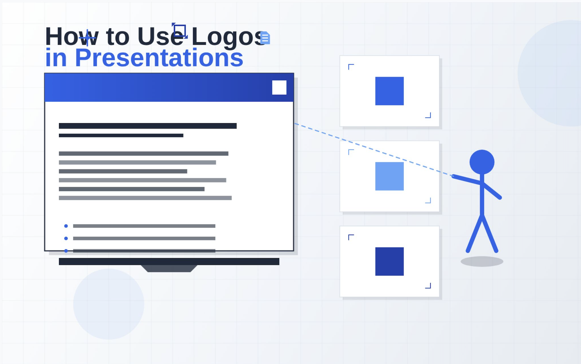
How to Use Company Logos in Presentations: A Complete Guide
Using company logos correctly in presentations is one of those details that separates amateur slide decks from professional ones. Whether you're creating a sales pitch, investor presentation, or internal company report, proper logo usage demonstrates brand awareness, design competence, and attention to detail.
Using company logos correctly in presentations is one of those details that separates amateur slide decks from professional ones. Whether you're creating a sales pitch, investor presentation, or internal company report, proper logo usage demonstrates brand awareness, design competence, and attention to detail.
This guide walks through everything designers, marketers, founders, and business professionals need to know about incorporating logos into PowerPoint, Google Slides, and other presentation formats. We'll cover placement strategies, sizing guidelines, technical implementation, legal considerations, and common mistakes to avoid.
By the end, you'll understand not just the mechanics of adding logos to slides, but the design principles that make presentations look polished and professional.
Why Logos Matter in Presentations
Logos aren't just decorative elements. They serve critical functions in business communication that directly impact how your presentation is received and remembered.
Brand recognition is the most obvious benefit. According to research from the University of Loyola, Maryland, color increases brand recognition by up to 80%, and logos are primary carriers of brand colors and visual identity. When used consistently across presentations, logos reinforce brand memory and make your materials instantly recognizable.
Professional credibility is equally important. A well-placed logo signals that you understand professional communication standards. It shows you've taken time to represent your brand properly, which audiences interpret as a proxy for how seriously you take your work overall. Presentations without proper branding often get dismissed as drafts or amateur work, regardless of content quality.
Visual consistency across your presentation deck creates a cohesive experience. When logos appear in predictable locations with consistent sizing, audiences can focus on your content rather than being distracted by design inconsistencies. This is especially crucial in longer presentations where dozens of slides need to feel like a unified whole.
Finally, logos contribute to trust building. Seeing recognizable brand marks from established companies lends authority to your presentation. This is why co-branded presentations with partner logos are so common in B2B contexts. The visual endorsement matters.
Understanding logo types helps inform placement decisions. Wordmark vs symbol logos have different visual weights, which affects how they balance on slides. Text-based wordmarks work well in headers, while compact symbol marks fit better in corners.
Where to Place a Logo on a Slide
Logo placement isn't arbitrary. Different positions serve different purposes and create different visual hierarchies. Here's how to think strategically about where logos belong.
Top Right Corner Placement
The top right corner is the most common position for recurring logos in corporate presentations. This placement follows natural reading patterns in Western cultures where eyes scan left to right, top to bottom. Placing logos in the top right keeps them visible without competing with slide content that typically anchors to the top left.
This position works particularly well for:
- Multi-slide decks where consistency matters
- Presentations with heavy text or data on the left
- Situations where you want the logo present but not dominant
Keep the logo small at this position, typically 0.5 to 1 inch in height for standard slides. Any larger and it starts dominating the visual hierarchy inappropriately.
Footer Placement
Footer placement centers or left-aligns the logo at the bottom of slides. This approach works best when:
- You want content to be the primary focus
- The deck has minimal footer information
- You're creating a more editorial or report-style presentation
Footer logos should be similarly sized to top corner logos (0.5 to 1 inch), though you can go slightly larger if the footer has ample white space. Many minimalist logo designs work particularly well in footer positions because their clean aesthetic doesn't overwhelm the bottom of the slide.
Cover Slide Branding
Your cover slide is the exception to the subtlety rule. This is where logos can and should be larger and more prominent, often 2 to 4 inches or more depending on the overall design. The cover sets the visual tone for your entire presentation.
Cover slide logo placement options include:
- Centered: Creates formal, symmetrical impact
- Top left: Establishes brand-first hierarchy
- Integrated into title: Makes logo part of the presentation name
- Large background element: For bold brand-forward presentations
The cover slide is also where you might incorporate multiple logo variations. You might use a colored version of your logo prominently on the cover, then switch to more subtle black or white versions on interior slides.
Co-Branded Presentations
When presenting with partners or featuring client logos, co-branding requires careful balance. The general rule is equal sizing and spacing for logos of equal importance.
Best practices for co-branded slides:
- Place logos at the same height on the same slide
- Use equal sizing unless there's a clear primary/secondary relationship
- Maintain consistent spacing between logos
- Place both logos in the same position across all slides (typically top corners or footer)
- Consider neutral backgrounds that don't favor one brand's colors over another
For presentations with many partner logos, a dedicated "partners" or "clients" slide works better than cramming multiple logos onto working slides.
When to avoid repeating logos on every slide: If your presentation is internal or the audience already knows your brand, consider limiting logos to the cover slide, section dividers, and closing slide. This creates a cleaner look and lets content breathe. Many tech companies use this approach for product demos and internal reports.
How Big Should a Logo Be in a Presentation
Logo sizing in presentations follows different rules than logo sizing for websites or print materials. The key principle is proportional presence without dominance.
General Sizing Guidelines
For recurring logos that appear on most slides:
- Height: 0.5 to 1 inch (36 to 72 pixels at standard resolution)
- Width: Maintain aspect ratio; typically 0.75 to 2 inches depending on logo shape
- Visual weight: Should occupy roughly 5-8% of slide real estate maximum
For cover slide logos:
- Height: 2 to 4 inches (144 to 288 pixels)
- Width: Scale proportionally; can span up to 40% of slide width
- Visual weight: 15-25% of the slide, balanced with title typography
These measurements assume standard 16:9 presentation dimensions. For 4:3 slides, reduce proportions by roughly 15%.
Safe Margins
Always maintain safe margins around logos to prevent them from feeling cramped or being cut off by projectors or different display ratios.
Standard safe margin rules:
- Minimum 0.25 inches from any slide edge
- For corner placement: 0.3 to 0.5 inches from both adjacent edges
- For footer placement: 0.5 inches from bottom edge minimum
These margins also create visual breathing room that makes logos appear more intentional rather than accidentally pushed to the edge.
White Space Considerations
White space (or negative space) around a logo is just as important as the logo itself. According to research published in the Journal of Marketing Research, adequate white space increases comprehension by up to 20% because it reduces cognitive load.
For logo spacing specifically:
- Maintain a "protection zone" equal to the logo's height in all directions
- On busy slides with multiple elements, increase this to 1.5x the logo height
- Never place text or other graphics closer than the protection zone allows
This principle applies whether you're working with complex brand symbols or simple wordmark designs.
Retina Scaling
With high-resolution displays becoming standard, retina scaling matters more than ever. A logo that looks sharp on your laptop might appear pixelated when projected or viewed on a 4K display.
Best practices for retina-ready logos:
- Use vector formats (SVG, EPS) whenever possible
- If using raster formats, export at 2x or 3x intended display size
- For a 1-inch logo, save the file at 2-3 inches before scaling down in your presentation software
- Test on multiple displays before finalizing
Understanding logo file formats is crucial here. Vector formats scale infinitely without quality loss, while high-resolution PNGs provide good results when vectors aren't available.
How to Add a Logo in PowerPoint
PowerPoint offers several methods for adding logos, but using the Slide Master ensures consistency across your entire presentation. Here's the complete technical process.
Basic Logo Insertion
For a one-time logo placement:
- Navigate to the Insert tab in the ribbon
- Click Pictures and select This Device
- Browse to your logo file and click Insert
- The logo appears on your current slide
This method works for unique placements like cover slides, but it's inefficient for logos that need to appear on multiple slides.
Using Slide Master for Consistency
The Slide Master is PowerPoint's template system. Logos added here automatically appear on all slides using that master layout.
Step-by-step process:
- Go to View > Slide Master in the ribbon
- Select the top slide in the left panel (this is the master slide that controls all layouts)
- Navigate to Insert > Pictures > This Device
- Select your logo file and insert it
- Position the logo where you want it to appear (typically top right corner or footer)
- Resize while holding Shift to maintain aspect ratio
- Click Close Master View to return to normal editing
Now the logo appears automatically on all slides using that master. You can still override individual slides if needed.
Locking Position
To prevent accidental movement:
- Right-click the logo in Slide Master view
- Select Format Picture
- Go to Size & Properties (the icon with arrows)
- Expand Properties
- Check Don't move or size with slide
This locks the logo position even when slide content shifts.
Maintaining Aspect Ratio
Never stretch or squash logos. This is one of the most common and egregious mistakes in presentation design.
To ensure proper scaling:
- Always hold Shift while dragging corner handles to resize
- Use the Format Picture panel to enter exact dimensions
- Lock aspect ratio in Size & Properties > Size > Lock aspect ratio
For detailed guidance on working with logos in PowerPoint, see our complete PowerPoint design guide.
Exporting Correctly
When sharing presentations, logo quality can degrade if export settings are wrong.
Best export practices:
- Save as PowerPoint file (.pptx): Preserves vector logos
- Export as PDF: Set quality to "High Quality" or "Minimum Size" (both preserve vectors)
- Export as images: Use maximum resolution (PNG at 300 DPI minimum)
- Embed fonts when sharing source files to prevent layout shifts
How to Add a Logo in Google Slides
Google Slides handles logos differently than PowerPoint, with some limitations but also some advantages for cloud collaboration.
Basic Image Insertion
To add a logo to a single slide:
- Click Insert in the menu bar
- Select Image
- Choose your upload method:
- Upload from computer: For local files
- Search the web: To find existing web images
- By URL: If your logo is hosted online
- Google Drive: For logos stored in Drive
- Position and resize as needed
Format Options
Google Slides provides several formatting controls for images:
Accessing format options:
- Select the logo image
- Click Format options in the toolbar (or right-click > Format options)
Key settings:
- Size & rotation: Enter exact dimensions
- Position: Set precise X/Y coordinates for pixel-perfect placement
- Drop shadow: Add subtle shadows for depth (use sparingly)
- Reflection: Generally avoid for logos
Master Slide Editing
For logos that appear on every slide, use the Master Slide:
- Open Slide > Edit master from the menu
- Select the master layout you want to modify (typically "Title Slide" or "Title and Body")
- Insert your logo using the method above
- Position and size it appropriately
- Click Close to return to normal editing
Changes made to the master automatically apply to all slides using that layout. This is particularly useful for creating branded templates that teams can reuse.
PNG vs SVG Discussion
File format matters in Google Slides, though less than in some other applications.
PNG (Portable Network Graphics):
- Works universally in Google Slides
- Can handle transparency
- Best for photos and complex graphics with many colors
- Resolution-dependent; can appear pixelated when scaled up
SVG (Scalable Vector Graphics):
- Google Slides has limited SVG support as of early 2025
- SVGs often get converted to PNG automatically
- If your SVG doesn't render properly, export a high-resolution PNG instead
Practical recommendation: Use high-resolution PNG files (at least 2x your intended display size) for reliable results in Google Slides. If you need to understand different logo formats more deeply, review explanations of EPS files and other professional formats.
Collaboration Features
Google Slides excels at collaborative logo management:
- Store brand logo files in a shared Google Drive folder
- Use Insert > Image > Google Drive to access them
- Create a master branded template that team members can copy
- Add logos to shared team theme templates
Do You Need Permission to Use a Company Logo?
Understanding the legal and ethical boundaries around logo usage is crucial. Using another company's logo without permission can result in trademark infringement claims, cease and desist letters, and in serious cases, legal action.
Internal Company Use vs External Use
Internal use (within your own organization for your own brand):
- You own or license your company logo
- You can use it freely in internal presentations, reports, and materials
- No additional permission needed
- Follow your own brand guidelines for consistency
External use (representing someone else's brand):
- Requires explicit permission or falls under specific legal exceptions
- Includes client presentations, partner materials, case studies, and marketing collateral
- Trademark law protects logos from unauthorized commercial use
- Permission usually comes via brand guidelines, partnership agreements, or licensing
Client Presentations
When creating presentations for clients (as an agency or consultant):
- You typically need explicit permission to use the client's logo
- This permission often comes through your service agreement
- Follow the client's brand guidelines exactly
- Get approval before using the logo in your own portfolio or case studies
When creating presentations about clients (referencing them as customers or partners):
- List them as clients: Usually acceptable if factual
- Use their logo: Requires permission unless covered by fair use (see below)
- Quote them or show metrics: Requires explicit approval
- Feature them prominently: Always get written permission
Educational Use
Educational contexts have more flexibility under fair use doctrine:
- Using logos in academic presentations to discuss companies
- Analyzing brand design in design courses
- Teaching case studies about companies
- Research presentations at conferences
These uses are generally protected because they're:
- Non-commercial in nature
- Transformative (analyzing or teaching, not just displaying)
- Unlikely to harm the trademark holder's interests
- Using minimal amounts of branded content necessary for the educational purpose
Important: Fair use is a legal defense, not a guarantee. When in doubt, credit the source and use logos minimally.
Avoiding Trademark Claims
To stay on the safe side of trademark law:
- Don't imply endorsement: Using another company's logo shouldn't suggest they endorse your product or service
- Don't modify logos: Present them exactly as the brand provides them
- Use proper attribution: Credit logo ownership where appropriate
- Follow brand guidelines: Most companies publish guidelines that explain acceptable use
- Get it in writing: For anything beyond fair use, request written permission
According to USPTO guidelines on trademark use, trademark law primarily concerns commercial use that could confuse consumers about the source of goods or services. Many legitimate business uses fall outside this scope.
Placeholder Logo Guidance
If you can't get permission to use a specific logo:
- Use the company name in text instead
- Create a neutral placeholder that indicates "Company X logo"
- Use generic category icons instead of specific brand marks
- Redesign the slide to not require the logo
For presentations that need professional polish but lack logo permissions, browse quality logo resources to understand what properly licensed logos look like and how to request them appropriately.
This is not legal advice. These are general best practices. For specific situations involving valuable intellectual property or high-stakes presentations, consult with a legal professional specializing in trademark law.
Common Mistakes When Using Logos in Presentations
Even experienced designers make these logo mistakes. Avoiding them immediately elevates your presentation quality.
Stretching or Squashing the Logo
The number one logo sin: distorting aspect ratios. When you drag a logo by its side handles instead of corner handles, you stretch or compress it. This makes logos look amateurish and shows disrespect for the brand.
Stretched logos communicate:
- Lack of attention to detail
- Unfamiliarity with basic design principles
- Carelessness about brand representation
Always resize from corner handles while holding Shift (in most applications). Better yet, input exact dimensions and lock the aspect ratio.
Using Low-Resolution Images
Pixelated logos scream "unprofessional." With modern 4K displays and high-resolution projectors, this problem has gotten worse even as technology improved.
Signs your logo resolution is too low:
- Jagged edges on curves and diagonals
- Visible pixel blocks
- Blurriness when viewed at normal size
- Colors look muddy or posterized
Solution: Use vector formats (SVG, EPS, AI) whenever possible, or raster images at least 2-3x your intended display size. A logo that will display at 1 inch should be saved at 2-3 inches at 300 DPI.
Using Unofficial Logo Versions
Every company has an official logo. Using unofficial versions, recreations, or "close enough" alternatives damages brand integrity.
Common unofficial version mistakes:
- Google Image Search downloads of compressed logos
- Screenshots of logos from websites
- "Similar font" recreations
- Old logo versions the company no longer uses
Solution: Always download logos from official sources: company brand portals, press kits, or directly from brand guidelines. Many companies offer professionally formatted logo files for public or partner use.
Overbranding
More logos don't mean more professional. Overbranding clutters slides and makes presentations feel more like advertisements than business communication.
Signs of overbranding:
- Logo on every single slide including transitional or quote slides
- Logo at multiple sizes in multiple positions
- Repeating the same logo multiple times on one slide
- Partner logos overwhelming actual content
Solution: Use logos strategically. Cover slide, key section dividers, and closing slide often suffice. For internal presentations to audiences familiar with your brand, less is more.
Poor Contrast
Logos need to stand out from their backgrounds. Poor contrast makes logos difficult to see and reduces their effectiveness.
Common contrast mistakes:
- Dark logos on dark backgrounds
- Light logos on light backgrounds
- Colored logos on similarly colored backgrounds
- Ignoring how logos will project in different lighting conditions
Solution: Use white logos on dark backgrounds, black logos on light backgrounds. When using colored logos, ensure sufficient contrast with the background color. Test your presentation in the actual presentation environment when possible.
Placing Logos on Busy Backgrounds
Even perfectly sized, properly contrasted logos fail when placed over complex background images, patterns, or textures.
Solution: Create a "safe zone" for logos by:
- Using solid or gradient backgrounds in logo areas
- Adding subtle drop shadows or glows to separate logos from backgrounds
- Placing semi-transparent shapes behind logos to create separation
- Choosing simpler backgrounds near logo placement areas
Best Practices for Co-Branded Slides
Co-branded presentations require diplomatic design. You're representing multiple organizations simultaneously, which means careful balance and clear hierarchy.
Equal Sizing for Equal Partners
When organizations have equal standing (partnerships, collaborations, co-marketing):
Size logos identically:
- Measure height and width precisely
- Don't rely on visual estimation (some logos "feel" bigger even at identical dimensions)
- Use guides and rulers to ensure exact sizing
- Consider the visual weight of different logo styles (wordmarks vs symbols)
Exception: If logos have very different shapes (one vertical, one horizontal), match them by visual weight rather than exact dimensions. A tall, narrow logo might need to be slightly larger in actual measurements to feel equivalent to a wide, short logo.
Alignment and Spacing
Horizontal alignment for side-by-side logos:
- Align logos to a common baseline (typically center-aligned or bottom-aligned)
- Maintain equal spacing between logos and from slide edges
- Use PowerPoint or Google Slides alignment tools for precision
Vertical stacking when logos must go one above another:
- Center-align both logos on the same vertical axis
- Maintain equal spacing above and below each logo
- Consider visual weight in your spacing decisions
Spacing rhythm: The space between logos should feel related to the space around the logo group. A common ratio is 1:2 or 1:1.5 (if logos are 0.5 inches apart, have 0.75-1 inch between the logo group and slide edges).
Neutral Backgrounds
Co-branded slides benefit from neutral backgrounds that don't favor one brand's color scheme over another.
Best neutral background choices:
- White or light gray
- Dark charcoal or black
- Subtle gradients using gray tones
- Textures in neutral colors
Avoid:
- One partner's brand colors as the dominant background
- Patterns or images that evoke one brand's style more than another
- Stark color combinations that make one logo stand out more than the other
Clear Visual Hierarchy
Sometimes organizations don't have equal standing. The primary brand should be visually dominant without completely overshadowing secondary brands.
For presentations where your company is primary:
- Your logo: Larger, top-left or more prominent position
- Partner logos: 25-40% smaller, secondary positions (top-right or footer)
- Your brand colors dominate the color scheme
- Partner logos on a neutral background or your branded background
For client presentations where the client is primary:
- Client logo: Larger and more prominent
- Your logo: Smaller, supporting position
- Use client's brand colors and guidelines
- Your agency/firm logo acts as a signature, not feature branding
Visual hierarchy techniques:
- Size (most obvious)
- Position (top-left has more visual weight than bottom-right)
- Color (vibrant colors attract more attention than muted ones)
- Contrast (higher contrast = more prominence)
Multi-Partner Presentations
For presentations featuring many partner logos (industry events, collaborative projects):
Create a dedicated partner slide:
- Display all partner logos at once
- Typically titled "Partners," "Sponsors," "Collaborators," or "Powered By"
- Arrange logos in a grid for visual order
- Size all equally unless sponsorship tiers exist
- Keep this slide clean with minimal text
On working slides:
- Use only the primary presenter's logo
- Reference partners in text without cluttering with logos
- Save visual real estate for content
Alphabetical ordering works well for equal partners (avoids implied hierarchy), though you can also organize by category, region, or contribution level.
Download High-Quality Logos for Your Presentation
Finding and using high-quality logos is often the difference between professional and amateur presentations. Here's where to source properly formatted logos.
Official Brand Resources
Always start with official sources:
- Company websites: Look for "Press Kit," "Media Resources," "Brand Assets," or "Brand Guidelines" pages
- Brand portals: Many large companies maintain dedicated brand portals (Adobe Brand Portal, Coca-Cola Brand Center, etc.)
- Direct request: Email the company's marketing team for official logo files
- Partner portals: If you have a business relationship, access partner resource centers
Official sources provide:
- Multiple file formats (SVG, PNG, EPS, PDF)
- Various color versions (full color, black, white)
- Different orientations (horizontal, vertical, icon-only)
- Usage guidelines and restrictions
- Proper aspect ratios and spacing specifications
Logo Download Resources
When official sources aren't available or practical, curated logo resources provide high-quality alternatives:
By color scheme:
- Colored logos: Full-color versions for standard backgrounds
- Black logos: Perfect for light backgrounds and minimal designs
- White logos: Essential for dark backgrounds and bold presentations
By category and format:
- Complete logo directory: Comprehensive collection searchable by industry, style, and format
- Logos organized by company type, making it easy to find tech company logos, finance logos, automotive brands, and more
- Multiple format options with proper licensing information
File Format Selection
Choose the right format for your presentation software and use case:
For PowerPoint presentations:
- PNG (preferred): Supports transparency, widely compatible
- SVG: Vector format, scales perfectly (PowerPoint 2016+ supports SVG)
- EPS: Professional vector format, requires conversion for older PowerPoint versions
For Google Slides:
- PNG (recommended): Best compatibility and reliability
- JPG: Works but lacks transparency support
- SVG: Limited support, may convert to PNG automatically
For print materials (when presentations get printed):
- EPS or PDF: Vector formats that scale infinitely
- PNG at 300 DPI minimum: If vector isn't available
Understanding the best logo formats for different contexts ensures you're using appropriate files for your specific needs.
Industry-Specific Collections
Tech company presentations: Tech startups and enterprise software companies often need logos from partners, clients, and ecosystem players. Look for technology-focused logo collections.
Finance and professional services: Banking, insurance, and consulting presentations require logos from regulatory bodies, financial institutions, and professional associations.
E-commerce and retail: Product presentations often showcase brand partnerships, supplier relationships, and retail channels.
Healthcare and pharmaceuticals: Medical presentations need logos from hospitals, research institutions, regulatory agencies, and pharma companies.
Having the right logos in the right formats saves time and prevents last-minute scrambles before important presentations.
Integration with Design Tools
Modern design workflows often involve multiple applications. Understanding how to use logos in Figma and other design tools helps when creating presentations assets or building slide templates.
The presentation you're creating is part of a larger brand ecosystem. Consistent logo usage across PowerPoint, Figma, website design, and marketing materials creates a cohesive brand experience.
Frequently Asked Questions
Can I use any company logo in my presentation?
No, you cannot freely use any company's logo without considering trademark law and usage rights. Unauthorized commercial use of company logos can constitute trademark infringement. However, several legitimate use cases exist: using your own company's logo (you own it), using logos in educational contexts under fair use (analyzing or teaching about companies), including client logos when you have explicit permission through contracts, and referencing companies factually in contexts that don't imply endorsement. Always check if the company provides brand guidelines or usage policies on their website.
Where should I place a logo on a slide?
The top right corner is the most conventional placement for recurring logos throughout a presentation, positioned 0.3 to 0.5 inches from both edges. This location keeps the logo visible without competing with slide content. Alternative placements include the footer area (centered or left-aligned), which works well for report-style presentations, and the cover slide, where logos should be larger and more prominent (2-4 inches). For co-branded presentations, place partner logos at equal heights with equal spacing, typically in opposite corners or side-by-side in the footer.
Should every slide have a logo?
Not necessarily. While adding logos to most slides maintains brand consistency, you don't always need logos on every single slide. Skip logos on transitional slides, quote slides, or full-image slides where logos would clutter the design. For internal presentations to audiences familiar with your brand, limit logos to the cover slide, major section dividers, and closing slide. This creates a cleaner aesthetic and allows content to be the focus. External presentations to unfamiliar audiences benefit from more consistent logo presence.
What file format is best for presentation logos?
PNG format is the most reliable choice for presentation logos across both PowerPoint and Google Slides. PNG files support transparency (crucial for logos), display consistently across platforms, and handle well at appropriate resolutions. For PowerPoint 2016 and newer, SVG (vector) format offers perfect scaling at any size, though older versions may not support it. Export PNG logos at 2-3x your intended display size at 300 DPI to ensure sharpness on high-resolution displays. Avoid JPG for logos with transparency or text elements, as the compression can create artifacts.
Can I edit a company logo to make it fit better?
No, you should never modify a company's logo. Editing, stretching, recoloring, or altering logos violates brand guidelines and potentially trademark rights. This includes changing colors, cropping elements, stretching to fit spaces, adding effects, combining with other graphics, or recreating the logo in a similar style. If a logo doesn't fit your design, adjust your design instead. Use different logo orientations (horizontal vs vertical) provided by the brand, request alternate versions from the company, or create more space in your layout. Maintaining logo integrity shows respect for brand identity and professionalism.
How do I add a logo to every slide automatically?
Use the Slide Master feature for automatic logo placement across all slides. In PowerPoint, go to View > Slide Master, insert your logo on the master slide at the top of the hierarchy, position and size it appropriately, then close Master View. The logo now appears on all slides using that master. In Google Slides, open Slide > Edit Master, select the master layout, insert your logo, then close master editing. This method ensures consistency, saves time when building multi-slide presentations, and allows you to change the logo globally by editing it once in the master.
Do presentation logos need to be high resolution?
Yes, presentation logos should be high resolution to avoid pixelation on modern displays. With 4K monitors and high-resolution projectors becoming standard, logos need to be sharp at display size. Use vector formats (SVG, EPS) that scale infinitely without quality loss, or raster formats (PNG) at least 2-3x your intended display size at 300 DPI minimum. A logo displaying at 1 inch should be saved at 2-3 inches. Test presentations on the actual display equipment when possible, as projectors sometimes reveal quality issues not visible on your laptop screen.
What's the difference between using logos in PowerPoint vs Google Slides?
The primary differences involve file format support and master slide functionality. PowerPoint offers better support for vector formats (SVG, EPS) in recent versions and has more sophisticated master slide controls with granular layout options. Google Slides provides simpler master editing but excels in collaboration, allowing teams to share logo resources through Google Drive integration. PowerPoint preserves logo quality better in PDF exports, while Google Slides automatically converts some formats. For consistent results across both platforms, use high-resolution PNG files and test your presentation in both applications before finalizing.
Read more
Subscribe to get fresh stories, tips, and logo resources delivered straight to your inbox.