🔥 Modulify.ai - Design Webflow sites with AI →

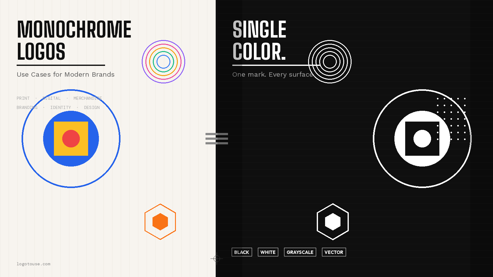
Monochrome logos are one of the most practical and enduring tools in visual identity design. Stripped of color, they force a logo to communicate through form, proportion, and contrast alone — and when that works, it works everywhere.
Monochrome logos are one of the most practical and enduring tools in visual identity design. Stripped of color, they force a logo to communicate through form, proportion, and contrast alone — and when that works, it works everywhere.
From embossed packaging to dark-mode app interfaces, a well-designed monochrome logo scales without friction. It prints cheaply, reads clearly at any size, and holds its authority across every medium your brand will ever touch.
This guide breaks down the specific use cases where monochrome logos outperform their colorful counterparts, which industries lean on them most, and how to design one that actually works. Whether you're building a brand from scratch or rationalizing an existing identity system, understanding when and why to go monochrome is a fundamental design skill.
A monochrome logo is a logo rendered in a single color or in varying shades of a single color. This includes fully black, fully white, and grayscale versions, as well as single-color variants in any hue.
The word "monochrome" comes from the Greek monos (single) and chroma (color). In branding, it refers to any mark that uses one consistent color tone across all its elements, with contrast created through shade, opacity, or reversal rather than multiple hues.
Designers and brand managers often use these three terms interchangeably, but they are technically distinct:
For practical branding purposes, the most commonly requested monochrome formats are a pure black version, a pure white version, and a single-color version matching the brand's primary hue. All three serve different surfaces but the same purpose: consistent reproduction regardless of printing or display constraints.
Interested in how this fits into a broader minimalist design system? Read our guide on minimalist logos explained, which covers the design philosophy behind stripping visual identity to its essentials.
Browse ready-to-download monochrome logo assets for your next project.
Same mark, different color systems. The monochrome version reads clearly on dark backgrounds and in single-color print applications.
The case for monochrome is not aesthetic preference alone. It is a practical, cost-driven, technically sound decision that affects everything from budget to brand consistency. Here are the four core reasons design-mature brands always maintain a monochrome version of their logo.
Printing in full color is expensive. Full-color offset printing can cost 3 to 5 times more than single-color runs, depending on volume and substrate. Monochrome logos eliminate this constraint entirely.
See our full breakdown on print-ready logo setup for technical specifications across different print environments.
The modern digital landscape has fractured. Your logo needs to exist on a 16x16px browser tab, a 1080x1080px Instagram post, a dark-mode mobile interface, and a 4K monitor simultaneously. Monochrome logos handle this range better than multi-color marks because they depend on contrast rather than hue.
For full guidance on which file formats serve each digital context, read best logo formats for websites.
Every additional color in a logo is a variable that can go wrong. Colors shift between screens. Printing processes introduce drift. A monochrome logo eliminates the largest source of brand inconsistency in multi-platform identity systems.
Monochrome directly cuts production costs across merchandise, packaging, and promotional materials. This is not a minor benefit for growing brands: screen printing a single-color design on apparel can cost 40–60% less than a four-color print, and embroidery pricing scales with thread color count.
Monochrome branding is not universal, but it is exceptionally well-suited to certain industries and brand positions. Here is where single-color logos perform best and why.
Startups ship fast across many platforms simultaneously. A monochrome mark works in an app, a Slack avatar, a pitch deck, and a hoodie without a second thought. It reads as modern and confident — the tone most early-stage tech brands want to project.
Black and white communicate restraint and authority. Luxury brands from Chanel to Balenciaga built their entire identity around monochrome. Color is abundant; restraint is rare. In luxury, rarity signals value. A monochrome logo says the brand does not need to try harder.
Fashion brands change seasonal colors constantly. A monochrome logo provides a stable anchor while campaigns evolve. It reproduces cleanly on garment labels, hang tags, tissue paper, and press materials without clashing with product colors.
Professional services brands operate in high-trust, low-risk-tolerance environments. Monochrome logos project seriousness, stability, and permanence. They also appear across letterheads, legal filings, and formal documents where color printing is not the norm.
Architecture brands live on blueprints, model photography, and editorial spreads — all contexts that favor monochrome. A single-color mark integrates cleanly into drawing sets and looks intentional against technical presentation aesthetics.
Freelancers, consultants, and creators need a logo that works on a portfolio site, a business card, a podcast cover, and an email signature. A strong monochrome mark delivers this with a single asset and no color-matching headaches.
Beyond industry verticals, monochrome logos dominate in specific physical product categories. The reason is almost always production: the fewer the colors, the simpler and cheaper the manufacturing process.
Screen-printed tote bags, debossed leather notebooks, foil-stamped business cards, and embossed wax seals: all of these are single-color by nature. A brand that only exists in multi-color form cannot leverage these tactile, premium-feeling production methods without creating a new asset from scratch.
Looking for monochrome-ready logo assets for your industry?
Not every brand needs to go fully monochrome, but every brand should have a monochrome version. Here are the specific scenarios where leading with a monochrome mark is the right strategic call.
For brands working through the wordmark vs. symbol debate, it's worth noting that wordmarks typically perform better in monochrome than complex symbol logos — letterforms hold legibility at small sizes. Symbols work in monochrome too, but they need to be geometrically clean to survive size reduction.
Monochrome is not a universal default. There are brand categories where color is not decoration: it is the core of what the brand communicates. Stripping these brands to monochrome weakens their primary message.
The rule of thumb: if your brand's color choice communicates something your brand cannot say without it, monochrome is a secondary format, not a primary one. Even in these cases, you should still have a monochrome version available. You just should not lead with it.
Designing for monochrome is a discipline in itself. Many logos that look strong in color fall apart when the color is removed, revealing structural weaknesses that the palette was masking. Here is a step-by-step process that produces a monochrome mark that works everywhere.
Design the logo in black and white from the very first sketch. This forces you to build contrast through form, weight, and shape rather than assuming color will do the work. If it reads clearly in black and white at the concept stage, it will read clearly everywhere.
Gradients are a monochrome trap. They look sophisticated on screen but disappear in single-color print, become muddy in photocopies, and are impossible to reproduce in embossing or screen printing. Design in flat, solid values from the start.
Render your logo at 16px (favicon), 32px (app icon), and 200px (business card). If detail is lost at small sizes, simplify. Logo resolution and DPI requirements vary significantly between contexts — your mark needs to hold integrity across all of them.
Every monochrome logo needs to work as both a dark mark on a light background and a light mark on a dark background. Design and test both versions explicitly. Some marks need minor adjustments (slightly thicker strokes, adjusted spacing) when reversed. See our logo placement best practices guide for background contrast rules.
Print the logo on a standard office printer in black and white. Then photocopy that printout. What survives is what your logo actually communicates in real-world monochrome conditions. Refine until the photocopied version is still readable and structurally clear.
Monochrome logos for professional use should always be provided as vector files: SVG for digital, EPS for print production. Raster formats lose quality when scaled. Read our guides on EPS logo files explained and vector vs. raster logos to understand which format to use where.
Specify approved monochrome variants, minimum size requirements, clear space rules, and approved background colors. If a vendor or team member has a brand guideline, they should be able to reproduce the monochrome mark correctly without asking. Ambiguity at this stage leads to inconsistent brand application across materials.
For designers working in modern tools, our guide on how to use logos in Figma covers the workflow for setting up and testing monochrome variants in a design system context. For presentation environments, see our logo in PowerPoint guide for placement and background rules.
The most recognizable logos in the world work just as well in black and white as they do in color. That is not an accident. It is a core requirement of the original brief. Here is what effective monochrome logos share in common and why they work.
You can explore high-quality monochrome logo assets across the LogoToUse collection to see how well-designed marks translate across color variants. For file format requirements when downloading, see our guide on how to convert logo files.
Context shapes perception. The same monochrome logo reads differently depending on the surface and material it appears on. Here are applications where monochrome logos create strong, premium impressions:
Answers to the most common questions about monochrome logo design and usage, structured for clarity.
A monochrome logo uses a single color — which can be any hue including black, white, or any other color — in a single tone or with shades and tints of that one color. A black and white logo is a specific type that uses only pure black and pure white, with no gray or intermediate tones. All black and white logos are monochrome, but not all monochrome logos are black and white. A logo in solid navy blue, for example, is monochrome but not black and white.
Yes, in most professional printing scenarios, monochrome logos offer significant advantages. Single-color printing is cheaper, more consistent, and compatible with more printing methods than full-color printing. Monochrome logos work in offset printing, screen printing, embossing, engraving, thermal printing, and stamp applications where multi-color reproduction is impractical or impossible. They also eliminate color drift between print runs, which is a common quality control problem in full-color production.
Yes, and in fact it should. Any professionally designed brand identity system includes approved monochrome variants alongside the primary color version. The monochrome version is used for print contexts, dark backgrounds, one-color merchandise, and formal documents. Having both does not create brand confusion as long as the brand guidelines clearly specify which version to use in which context. A well-designed logo will work in both color and monochrome because its structure does not depend on color to communicate.
Many of the world's most recognized luxury brands use monochrome as their primary brand expression. Chanel, Balenciaga, Bottega Veneta, and many others built global recognition primarily through black typography and marks rather than color. The reasoning is strategic: restraint signals confidence, and confidence in a luxury context signals exclusivity. Color is abundant and accessible; a monochrome mark that stands out through form alone communicates that the brand does not need to compete for attention. That said, luxury brands like Hermès (orange) and Tiffany (blue) have made color itself a luxury asset — so monochrome is a strategy, not a rule.
Monochrome logos are an excellent strategic choice for most startups, particularly in tech, B2B, professional services, and design-adjacent industries. They work across all platforms from day one, reduce production costs significantly, and scale from a 16px app icon to a 10-foot trade show banner without degradation. A clean, confident monochrome mark also projects maturity and intentionality that over-designed colorful startup logos often undermine. Startups that want to look established rather than early-stage often benefit from the restraint of a monochrome identity.
Converting a logo to monochrome is not simply desaturating the color. The correct process involves removing all color fills and replacing them with black, white, or a single brand color; eliminating gradients and replacing them with flat solid tones; testing the result at multiple sizes to ensure legibility; and creating both a dark-on-light and light-on-dark version. In Figma, Illustrator, or similar tools, this means manually adjusting fills rather than using desaturation filters, which create gray tones that do not print cleanly in single-color applications.
For professional use, monochrome logos should be provided in SVG or EPS vector format. SVG is the standard for digital applications including websites, apps, and presentations. EPS is the standard for professional print production. PNG with a transparent background works for most everyday digital use cases. Avoid JPEG for monochrome logos as it introduces compression artifacts that are highly visible against flat black or white areas.
A monochrome logo needs two variants to work on both backgrounds: a dark version (typically black or dark brand color) for use on light backgrounds, and a light version (typically white or light brand color) for use on dark backgrounds. Using only one version on the wrong background type will result in the logo being invisible or illegible. Always test both reversals before finalising your brand assets.
Ready to download professional monochrome logo assets for your next project? Browse the full collection at logotouse.com
Subscribe to get fresh stories, tips, and logo resources delivered straight to your inbox.
'Stuff you need to read we cover it here


.svg)


Design By OwlsTech Service