Design Trends
|
Mar 10, 2026
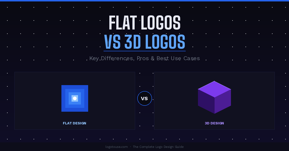
Flat Logos vs 3D Logos: Key Differences, Pros, and Best Use Cases
Logo styles evolve alongside design trends and technology. What worked visually on a 1990s product box is not what works on a 2025 phone screen, and what dominates mobile interfaces does not always translate into a cinematic game intro. Two of the most widely used visual approaches in branding today are flat logos and 3D logos, and understanding the difference between them is more than an aesthetic exercise.
Logo styles evolve alongside design trends and technology. What worked visually on a 1990s product box is not what works on a 2025 phone screen, and what dominates mobile interfaces does not always translate into a cinematic game intro. Two of the most widely used visual approaches in branding today are flat logos and 3D logos, and understanding the difference between them is more than an aesthetic exercise.
Both styles serve genuinely different purposes depending on brand identity, platform usage, and visual goals. The wrong choice leads to a logo that looks polished in one context and broken in another. The right choice creates a mark that travels effortlessly across every touchpoint your brand occupies.
This guide breaks down what each style actually is, what the data says about design effectiveness, and how to decide which approach fits your brand or project.
What Is a Flat Logo?
A flat logo is a mark built from simple shapes, solid or minimally graduated colors, and clean lines, without shading, shadows, highlights, or any effect that simulates three-dimensional depth. It communicates purely through form and color rather than illusion.
Flat design as a broader movement became mainstream around 2013 when Apple and Google both shifted away from skeuomorphism (the trend of making digital elements mimic physical textures) toward flatter, more abstract interfaces. The driving logic was practical: small screens needed clarity, not decoration. Icons had to be readable at 24 pixels. App logos had to survive on a retina display and a low-resolution browser tab at the same time.
That logic moved directly into logo design. Brands realized that a logo living in a phone's notification bar, a website header, a favicon, and a social media profile picture simultaneously could not afford gradients and gloss effects.
Key characteristics of flat logos:
- Solid fills or very subtle, minimal gradients
- No drop shadows, gloss effects, or depth rendering
- Limited, intentional color palette
- Geometric or highly simplified organic shapes
- Works equally well in black, white, or color without losing meaning
Classic examples include the Google logo after its 2015 redesign (which replaced a serif, slightly shadowed wordmark with a clean geometric sans-serif), the Spotify logo (a flat green circle with three abstract sound waves), and the Microsoft logo (four colored flat squares, no shadow, no bevel). All three are readable at any size and instantly recognizable in monochrome.
According to data compiled by Digital Silk, 75% of consumers judge a brand's credibility based on its logo, and logos with simple iconography are 50% more recognizable than complex ones. Simplicity is not just an aesthetic preference; it is a measurable performance advantage.
A well-constructed flat mark also transitions effortlessly between colored logos, black logos, and white logos without losing integrity. This flexibility is a critical requirement for brands that operate across dark backgrounds, light backgrounds, and print collateral at the same time.
If you want to go deeper on the philosophy behind this approach, minimalist logo design is the closest cousin to flat design and shares most of its underlying principles.
What Is a 3D Logo?
A 3D logo uses shading, gradients, highlights, perspective, and dimensional rendering techniques to make a mark appear as though it occupies physical space. Rather than presenting a flat symbol, a 3D logo creates the illusion of an object you could pick up and turn over in your hand.
This style has deep roots in entertainment, gaming, and cinematic branding. These are industries where visual spectacle is part of the product itself. The PlayStation logo in its dimensional forms, the Warner Bros. shield rendered in gold and depth, and the visual identity systems used by major film studios all use 3D effects to signal richness, prestige, and production value.
Key characteristics of 3D logos:
- Gradients that simulate light source and shadow
- Highlights suggesting directionality and material
- Cast shadows or raised surfaces
- Perspective, foreshortening, or isometric rendering
- Sometimes full photorealistic renders of three-dimensional objects or typography
3D logos also excel in animation. When a logo needs to spin, unfold, or morph in a motion graphics sequence, a 3D design gives animators genuine depth to work with. The mark becomes a visual character rather than a flat symbol, which is why 3D treatments dominate in game studios, sports franchises, and premium product packaging.
It is worth noting that 3D logos exist on a spectrum. At one end, you have fully rendered photorealistic three-dimensional objects. At the other, you have what designers increasingly call semi-flat logos, marks that use a single light gradient or a soft shadow to hint at dimension without committing to full dimensionality. The 2024 LogoLounge Trend Report specifically identified the "Flat Box" as a major emerging trend: isometric cube shapes that render the illusion of 3D on a flat surface, bridging the two worlds.
Flat Logos vs 3D Logos: The Core Differences
The choice between flat and 3D is rarely just about visual style. It ripples through scalability, print production, digital performance, and how the brand is perceived by different audiences.
| Dimension | Flat Logo | 3D Logo |
|---|---|---|
| Design complexity | Low to medium. Relies on form and proportion. | High. Requires rendering, lighting, and depth planning. |
| Visual depth | None or minimal. | Significant. Simulates three-dimensional space. |
| Scalability | Excellent. Reads clearly at any size. | Limited. Gradients and detail can break at small sizes. |
| Print compatibility | High. Works in spot color, embroidery, and engraving. | Moderate. Gradients struggle in many print processes. |
| Digital interface use | Ideal. Clean at any resolution, fast-loading. | Acceptable in high-res contexts. Risky at small sizes. |
| Brand perception | Modern, clean, trustworthy, tech-forward. | Powerful, premium, entertaining, cinematic. |
| Animation potential | Good for 2D motion. Limited depth to exploit. | Excellent. Native to 3D animation pipelines. |
| Monochrome reproduction | Clean and consistent. | Requires a separate simplified version. |
Advantages of Flat Logos
Flat logos have dominated mainstream brand design for over a decade. Their advantages are structural, not just fashionable.
Better scalability across every context. A flat logo built as a vector scales from a 16px favicon to a 30-foot billboard without losing clarity. The absence of gradients means there is nothing to degrade at extreme sizes.
Faster loading for web and apps. Flat SVG files are significantly smaller than raster 3D renders, which means faster load times. Page speed directly affects both user experience and search ranking, making this a measurable performance advantage for digital-first brands.
Works well at very small sizes. App icons, favicons, browser tabs, and email signature logos all demand that a mark be readable at tiny dimensions. Flat logos handle this natively. 3D logos typically need to be simplified before they work at these sizes.
Cleaner, modern aesthetic. According to research cited by Linearity, brands that transitioned from intricate logos to simplified ones saw a 21% increase in positive brand perception. Clean design signals confidence and clarity to modern audiences.
Easier brand consistency. With fewer visual elements to manage, flat logos are easier to apply consistently across a team. Designers, marketing staff, and external vendors are less likely to produce inconsistent or broken versions.
Superior print versatility. Flat logos work cleanly in spot-color printing, screen printing on fabric, embossing, embroidery, and engraving. They work in monochrome without requiring a separate design iteration.
If you regularly drop logos into design tools for presentations or layouts, a flat SVG is always the path of least resistance. The guide to using logos in Figma covers exactly why flat, vector formats are the standard starting point for digital design workflows.
Advantages of 3D Logos
Despite the dominance of flat design in everyday digital branding, 3D logos hold genuine competitive advantages in the right contexts. Dismissing them as outdated misses the point entirely.
Stronger visual impact and memorability. Depth creates drama. A well-executed 3D logo commands attention in ways that a flat mark often cannot. In a crowded visual field, like a sports arena, a game title screen, or a packaging shelf, dimensional logos compete harder.
Perceived premium quality. Highlights, shadows, and material rendering communicate craftsmanship and production value. Luxury products, high-end gaming peripherals, and prestige entertainment brands use 3D logos partly because depth is subconsciously associated with investment and effort.
Ideal for animation and motion graphics. A 3D logo asset is ready to spin, light-sweep, assemble, and disassemble in motion sequences. This makes it native to the production pipelines of broadcast, film, and gaming studios. As animated logos grow in prevalence, 3D designs have a structural head start.
Industry alignment in entertainment and gaming. Players and viewers expect dimensional, cinematic branding in these spaces. A flat logo from a game studio can actually read as less credible in certain categories because it does not match the production value audience expectations that genre has established.
Differentiation in flat-dominated markets. In a sea of minimalist competitors, a thoughtfully executed 3D logo can stand out simply because it is doing something visually different. Differentiation is always contextual, and sometimes bucking the flat trend is the strategic move.
When to Use a Flat Logo
Flat logos are the pragmatic choice for most modern brands, particularly those operating primarily in digital environments.
Flat logos are the best choice when:
- Your logo needs to function as an app icon or favicon at very small sizes
- Your brand appears regularly in web headers, email signatures, and social media profiles
- You need one mark that works in full color, black, and reversed white without redesign
- Print applications include embroidery, screen printing, engraving, or one-color offset
- You need fast-loading digital assets that do not slow down page performance
- Your team or external vendors will apply the logo without a designer present
Industry categories where flat logos consistently perform best:
- SaaS and software companies
- Fintech and banking
- Healthcare and wellness apps
- Consumer tech brands
- Startups with digital-first marketing
- Any brand that needs logo versatility across dozens of platforms
Quick checklist: is a flat logo right for your brand?
- Your primary presence is digital (web, app, social)
- Your logo needs to work at very small sizes
- You need one version that covers multiple color modes
- Your brand should feel modern, clean, or minimal
- You have a wide range of print applications planned
- Consistency across a non-designer team matters
Proper logo placement is also simpler with a flat mark, since there are no lighting angles or directional shadows to account for when compositing across different backgrounds.
When preparing a flat logo for production, print-ready logo setup and understanding logo resolution and DPI are worth reviewing before you hand files off to a printer or vendor.
When to Use a 3D Logo
3D logos are not wrong choices. They are specialized choices. There are specific brand contexts where a 3D mark is not just acceptable but is the strongest possible option.
3D logos are the best choice when:
- Your logo will appear primarily in high-resolution digital or large-format print contexts
- Your brand is built for animation, broadcast, or motion graphics output
- Visual spectacle and production value are part of your brand promise
- Your category is gaming, film, sports, or entertainment
- Product packaging is a primary brand touchpoint where shelf presence matters
Industry categories where 3D logos consistently perform best:
- Video game studios and publishers
- Film and television production companies
- Sports teams and leagues
- Premium consumer products and luxury goods
- Theme parks and entertainment venues
- Esports organizations and gaming peripherals
Quick checklist: is a 3D logo right for your brand?
- Your primary output is film, broadcast, or animated content
- You are in gaming, sports, or entertainment
- You rarely need the logo at very small digital sizes
- You have a production pipeline that can render and maintain 3D assets
- Visual spectacle is a core part of what your brand promises
- You can maintain a separate flat version for UI and practical print use
One practical note: if you are building a 3D logo, plan your file workflow carefully from the start. 3D renders typically exist as raster files with resolution limitations. Understanding how to convert logo files across formats, and what you can and cannot do in each format, will save significant headaches in production.
If your 3D logo needs to go into a presentation or document, the guide to using logos in PowerPoint covers common pitfalls when gradient-heavy or raster logo files are placed into office software.
Can a Brand Use Both Flat and 3D Logos?
Yes, and many of the world's most successful brands do exactly this. The concept is called an adaptive logo system: a family of logo versions engineered to perform in different environments, rather than a single mark forced to do everything at once.
The logic is straightforward. A flat version handles the heavy lifting of everyday digital and print use: website headers, app icons, email signatures, business cards, signage, and merchandise. A 3D version handles high-impact moments: broadcast intros, marketing campaigns, launch trailers, hero banners, and packaging where visual richness is worth the production cost.
Google is a useful example. The core Google logo is flat and geometric. But Google regularly uses dimensional, animated, and illustrative treatments of its wordmark in advertising campaigns, hardware packaging, and video content. The flat version is the workhorse. The dimensional version is the showpiece.
Film studios offer another model. A production company maintains a flat version for contracts, watermarks, and website use, while deploying a fully rendered three-dimensional version in theatrical title sequences and marketing materials.
Building an adaptive logo system requires:
- A primary flat version as the default for all everyday use
- A defined 3D or dimensional version for specific high-impact applications
- Clear brand guidelines specifying which version is used where
- A monochrome version of the flat mark for single-color print applications
- Organized file libraries so anyone on your team can access the right version quickly
Understanding EPS logo files and how different formats behave across applications helps build a library that works for every member of your team, not just the designer who created the original.
For brands working through what type of logo mark to pair with each format, the comparison of wordmark vs symbol logos is worth reading alongside this guide. The flat vs 3D decision often intersects with the mark vs wordmark decision in ways that compound each other.
Current Logo Design Trends
Where does the flat vs 3D debate stand right now? The binary is blurring, and several forces are reshaping how designers think about both styles simultaneously.
Flat design remains dominant for new brand identities. The majority of logos launched by tech companies, consumer brands, and startups continue to be flat or near-flat. This is partly practicality (digital-first brands need digital-first logos) and partly cultural, since the association between minimalism and modern credibility remains strong across most categories.
Semi-flat and subtle-depth logos are growing fast. The LogoLounge 2024 Trend Report specifically identified "Flat Box" designs as a major direction: isometric cube shapes that create a trompe l'oeil illusion of depth on a flat surface. This middle path lets brands feel contemporary while adding just enough visual dimensionality to avoid flatness feeling sterile.
Animated and motion logos are becoming standard. Gradients, according to the same LogoLounge report, are increasingly being animated to create organic, morphing color transitions rather than static fills. This pushes even flat-logo brands to create animated versions that add temporal depth rather than spatial depth. A logo that moves answers the depth question differently than one that is designed static.
AI is accelerating iteration across both styles. Logo prompt engineering has matured to a point where designers can generate and explore both flat and 3D concepts at speed. This is lowering the cost of exploring both directions and may lead to more brands building dual systems from the start rather than treating it as a resource-intensive decision.
The question is shifting from style to behavior. The most forward-looking brand identity work being done today starts not with "flat or 3D?" but with "how does this logo need to behave, and what system of variations will serve every context it enters?" Style follows function, and function now includes animation, responsiveness, and format adaptability in ways that simply did not exist a decade ago.
Frequently Asked Questions
What is the difference between flat and 3D logos?
Flat logos use simple shapes and solid or minimally graduated colors without any effects that simulate depth. 3D logos use shading, gradients, highlights, and perspective to create the illusion that the mark occupies three-dimensional space. The core difference is whether the logo communicates through form and color alone (flat) or through simulated physical depth and lighting (3D).
Are flat logos better for modern brands?
For most modern brands, particularly those operating primarily in digital environments, flat logos are the more practical and versatile choice. They scale cleanly to any size, work across digital and print contexts without modification, and align with contemporary design aesthetics. That said, "better" is always relative to the brand's specific industry, audience, and primary use contexts.
Do 3D logos look outdated?
Not necessarily. The dated perception comes from the heavy bevels and lens-flare gradients that were overused in the early 2000s. Contemporary 3D logo design is a different category: sophisticated rendering, intentional lighting, and purposeful dimensionality used in gaming, film, sports, and entertainment branding. When executed well and deployed in the right context, a 3D logo signals ambition and production value rather than obsolescence.
Which logo style is better for mobile apps?
Flat logos are almost always the better choice for mobile apps. App icons appear at very small sizes across a range of device resolutions and backgrounds. Flat designs retain their clarity and legibility at these sizes, while 3D logos with gradients and shadows can become muddy or illegible when reduced to a 60px icon. The dominant visual language of major app ecosystems is flat for exactly this reason.
Can a logo be both flat and 3D?
Yes. Many brands maintain both a flat primary logo for everyday digital and print use, and a 3D or dimensional version for high-impact marketing, animation, and cinematic contexts. This is called an adaptive logo system. The flat version handles reliability and versatility; the 3D version handles visual impact when the context justifies the investment.
Are 3D logos harder to print?
Yes, in most cases. 3D logos rely on gradients, shadows, and shading effects that reproduce poorly in spot-color printing, screen printing on fabric, embroidery, engraving, and foil stamping. These processes require solid fills or simplified artwork. A 3D logo used in these contexts typically needs a separate flat or simplified version created specifically for print, which adds cost and complexity to the brand asset library.
What file format should I use for a flat logo?
SVG is the ideal format for flat logos used on websites and in digital interfaces because it scales infinitely without quality loss and has a minimal file size. For print, EPS or PDF vector formats are standard. For situations where a raster file is required, a high-resolution PNG with a transparent background is the practical choice. The full breakdown of best logo formats for websites covers each format in detail.
Is a flat logo easier to design than a 3D logo?
Flat logos are generally less technically complex to produce, but they are not necessarily easier to design well. Because flat logos strip away decorative complexity, the quality of the underlying form, proportion, and color choices becomes fully exposed. A weak flat logo has nowhere to hide. 3D logos require more technical skill in rendering and lighting, but the added visual richness can mask weaker foundational design decisions. The hardest design challenge is building a flat logo that is simple but still distinctive and genuinely memorable.
How do I decide between a flat and 3D logo for my brand?
Start by mapping where your logo will actually appear. If your primary contexts are a website, a mobile app, social media profiles, email signatures, and standard print materials, a flat logo will serve you better in nearly every one of those applications. If your primary contexts include broadcast intros, game title screens, film credits, animated marketing videos, or premium packaging where visual richness matters, a 3D or semi-3D approach is worth the investment. When in doubt, build a flat logo first and add a dimensional version later if the brand grows into contexts that demand it.
Read more
Subscribe to get fresh stories, tips, and logo resources delivered straight to your inbox.