

Most AI logo prompts fail before they're even submitted. They're too vague, too crowded with ideas, or missing the structural constraints that steer models toward clean, brand-ready outputs. Logo prompt engineering fixes that.
This guide walks through how AI models interpret logo prompts, what a high-quality prompt looks like, and 10 tested examples across industries. You'll also find a practical workflow for turning AI-generated concepts into real vector assets.
What Is Logo Prompt Engineering?
AI image generators like Midjourney, DALL-E 3, and Adobe Firefly respond to natural language instructions. But these models weren't trained exclusively on logo design. They've learned from vast datasets spanning photography, illustration, concept art, and typography. Without tight constraints, a logo prompt competes against every other visual interpretation the model has ever seen.
Logo prompt engineering is about adding structure that removes ambiguity. Instead of asking for "a logo for a coffee shop," you specify the style, the symbol concept, the color palette, and the output format. Each additional layer of constraint narrows the model's decision space toward something cleaner and more logo-like.
Logo prompt engineering is the process of writing structured prompts that guide AI image models to generate simple, recognizable, and brand-appropriate logo concepts.
A successful AI logo output has three characteristics: a clear silhouette that reads at small sizes, a limited color palette (typically two to three colors), and minimal visual complexity. These are not the default outputs of most AI tools. They're what you get when your prompt engineers them deliberately.
According to Statista, the global generative AI market is projected to exceed $1.3 trillion by 2032, with design applications among the fastest-growing segments. Prompting skill is already separating designers who get useful AI outputs from those who get generic noise.
Why Most AI Logo Prompts Fail
The five most common failure modes are consistent across tools and skill levels.
1. Vague prompts produce average outputs
When a prompt lacks specificity, the model fills the gap with its statistical average. "A logo for a tech startup" will generate something that looks like the midpoint between every tech logo the model has seen. It won't be yours.
2. Too many concepts create visual clutter
Prompts that ask for "a mountain, a circuit board, a globe, and a rocket" are giving the model four competing ideas to resolve. The output is almost always busy and unusable. Good logos are built on one idea.
3. No style constraints leave the door open to everything
Without style direction, AI models default to illustrative, photorealistic, or overly decorative outputs. None of these translate well to actual logo use cases: website headers, business cards, or embroidery.
4. Missing background and composition direction
AI outputs without background constraints often render on gradients, textures, or dark scenes. A logo needs to be evaluated on white, and it needs to be centered and isolated to function as a real asset.
5. Conflicting style cues confuse the model
Asking for "a minimalist retro vintage 3D futuristic logo" is asking the model to resolve contradictions. Each style modifier pulls the output in a different direction. The result is incoherent.
Why it fails: No industry context, no style specification, no symbol concept, no color direction, no technical constraints. Every word is subjective. The model has no useful information to work with.
The Anatomy of a High-Quality Logo Prompt
Every effective logo prompt follows a repeatable formula. Once you understand the components and what each one does, you can build prompts for any industry or style in under two minutes.
Understanding the difference between wordmark and symbol logos helps you decide which components to emphasize. Wordmarks need brand name and typography direction. Symbol marks need a stronger symbol concept and can omit the brand name entirely.
10 Logo Prompt Examples That Work
These prompts have been built using the formula above. Each is optimized for a specific type of logo output. Use them as starting points, then swap in your brand name, industry context, and color palette.
Notice that each prompt stays under 50 words, includes exactly one symbol concept, and uses concrete style language rather than vague quality descriptors. That discipline is what separates outputs worth developing from outputs worth discarding.
Prompt Modifiers That Improve Logo Quality
Modifiers are short phrases you append to any logo prompt to steer the model away from common failure patterns. Think of them as guardrails. The more precisely you use them, the tighter your output range becomes.
| Modifier | What It Does |
|---|---|
| flat vector logo | Pushes output toward vector-appropriate flat design. Reduces shadows, gradients, and photorealism. |
| minimalist | Reduces visual complexity. The model removes decorative elements and simplifies shapes. |
| simple geometric shapes | Directs the model toward circles, triangles, and rectangles rather than organic or illustrative forms. |
| centered logo | Ensures the mark is isolated and centered in the frame, not placed off-axis or surrounded by context. |
| icon only | Suppresses text generation. Useful when you want a symbol mark without an AI-rendered wordmark. |
| white background | Isolates the mark and makes it easier to evaluate. Also simulates real-world usage on light surfaces. |
| no gradients | Prevents the model from adding color transitions that make logos harder to reproduce in print or single-color formats. |
| clean negative space | Encourages open, breathable layouts. Good logos need room to breathe. |
| modern sans-serif typography | For wordmark prompts, this guides text rendering toward clean, contemporary typefaces. |
| professional logo design | A broad alignment modifier. Not always necessary, but useful as a closing signal when other constraints are in place. |
Stack three to five of these at the end of every prompt. They cost you nothing and consistently improve output quality. The most reliable combination for clean icon-only marks is: flat vector logo, minimalist, white background, no gradients, icon only.
Tips for Generating Cleaner AI Logos
Prompt structure handles about 70% of the problem. These habits handle the rest.
- Limit the concept to one symbol idea. Every additional symbol concept you add halves your chance of a usable output. Pick one anchor and commit.
- Keep prompts structured, not long. Length doesn't improve AI outputs. Precision does. A 40-word structured prompt almost always outperforms a 120-word rambling one.
- Use neutral backgrounds in every run. White or light gray backgrounds let you evaluate the actual mark without environmental interference.
- Generate in batches of four and compare silhouettes. Don't judge AI logos on color or detail. Judge the underlying shape first. If the silhouette doesn't work at 50px, nothing else will fix it.
- Iterate one variable at a time. Change the symbol concept, or the style, or the color, but not all three at once. Systematic iteration builds understanding of what each variable is doing.
- Avoid photorealistic and illustrative cues. Words like "realistic," "detailed," "textured," "painted," or "3D render" push the model away from logo-appropriate outputs.
- Try negative prompting where the tool supports it. In Midjourney, use the --no parameter to exclude specific elements: --no text, --no gradients, --no shadows, --no watermark.
These principles apply regardless of which AI tool you're using. The underlying logic is the same: reduce the model's interpretation space, maintain compositional discipline, and evaluate outputs on their structural merits before their surface details.
If you're building a design system around multiple logo variants, understanding what makes minimalist logos work will help you choose the strongest AI concepts with more confidence.
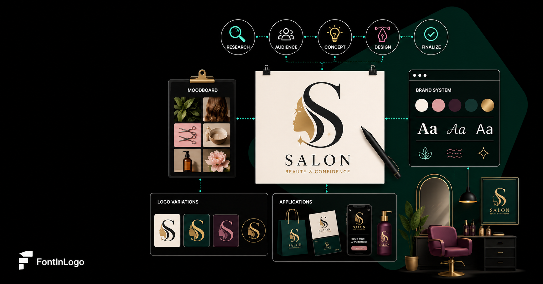
From AI Concept to Usable Logo
The most common mistake after generating a strong AI logo concept is trying to use it directly. AI outputs are concept starters, not final brand assets. They need to be rebuilt in vector software before they're production-ready.
According to a Nielsen Norman Group report on AI in design workflows, designers who use AI for ideation and then rebuild outputs in professional tools produce higher-quality results than those who attempt to use AI outputs directly. Teams working on production-ready digital products often follow a similar pattern across branding and build workflows, using tools and partners such as Figma, Illustrator, and Azumo's AI-powered software development services to move from early concepts to polished, usable assets without relying on raw AI output alone. The AI accelerates concepting. Designers own the execution.
Generate multiple variations
Run your best prompt four to eight times. Small randomization differences between generations often produce meaningfully different silhouettes. Collect the batch before evaluating.
Pick the strongest silhouette
Reduce all outputs to grayscale and scale them down to 50px wide. The mark that reads clearest at small size is your starting point. Ignore color, detail, and text at this stage.
Rebuild in vector software
Trace the selected concept in Figma or Illustrator using basic shape tools. Don't use auto-trace. Manual reconstruction gives you clean, editable geometry that the AI output never has. Check out our guide on using logos in Figma for the technical setup.
Clean geometry and spacing
Align anchor points to whole pixel values. Check that curves are smooth and consistent. Set clear spacing rules between the icon and any wordmark. This is where logos go from "concept" to "brand asset."
Build your color variants
Every professional logo needs at least three versions: full color, black, and white. Some brands also maintain a colored variation for different contexts. Build all three from the start.
Export in the right formats
SVG for web use, PNG with transparent background for digital placement, and a vector PDF or EPS for print. Understanding the best logo formats for different contexts ensures your logo works everywhere it needs to.
For print-specific deployment, review proper print-ready logo setup to make sure your rebuilt vector meets production standards. And if you're working with files from clients or legacy brand assets, the guide to converting logo files covers the technical steps in detail.
Understanding the difference between vector and raster logos is also critical here. AI outputs are raster images. Your final logo needs to be vector. That gap is the whole reason manual reconstruction is non-negotiable.
AI and Logo Design: Context by the Numbers
These figures reflect how embedded AI has become in professional design, and why prompting skill is becoming a core competency rather than a novelty. The designers who get the most from AI tools are not those with the most expensive subscriptions. They're the ones who understand how to structure their input.
How to Write a Logo Prompt: Step-by-Step
If you want a quick reference format, here's the complete process condensed:
- Define the brand name (include it if you want a wordmark; omit it for icon-only concepts)
- Specify the industry (this grounds the model in the right visual vocabulary)
- Choose one logo style (minimalist, geometric, monoline, emblem, lettermark)
- Add one symbol concept (a shield, a leaf, a node, a letter, one idea only)
- Set a color palette (two to three colors maximum, described concretely)
- Add constraints (minimalist, flat vector logo, no gradients, white background)
- Specify output format (icon only, centered composition, professional logo design)
- Generate variations and iterate (change one variable at a time across runs)
This process applies equally to Midjourney, DALL-E 3, Adobe Firefly, Ideogram, and any other text-to-image tool. The underlying model differs. The prompting logic doesn't.
Frequently Asked Questions
Logo prompt engineering is the process of writing structured prompts that guide AI image models to generate simple, recognizable, and brand-appropriate logo concepts. It involves using a repeatable formula that includes industry context, style direction, a single symbol concept, a defined color palette, and technical constraints like "flat vector logo" and "white background." The goal is to reduce the model's interpretation space and steer it toward clean, usable outputs.
A good AI logo prompt is specific, structured, and constrained. It includes a clear industry context, a single logo style (minimalist, geometric, monoline, or emblem), one concrete symbol concept, a palette of two to three colors, and technical output constraints like "flat vector logo, no gradients, white background, centered composition." Prompts that try to pack multiple concepts or conflicting styles into a single request produce cluttered, unusable results.
The most consistently effective modifiers are: flat vector logo, minimalist, simple geometric shapes, centered logo, icon only, white background, no gradients, clean negative space, and modern sans-serif typography. Stack three to five of these at the end of your prompt. The most reliable combination for clean icon marks is: flat vector logo + minimalist + white background + no gradients + icon only.
AI can generate strong logo concepts and compelling silhouettes, especially when prompts are well-structured. However, AI outputs are not ready to use as final brand assets. They contain geometric inconsistencies, imprecise curves, and unreliable text rendering. A professional workflow uses AI for rapid ideation, then manually rebuilds the strongest concepts in Figma or Illustrator before deployment. The AI handles concepting speed. The designer handles precision and final quality.
To push AI outputs toward minimalism, use the modifiers "minimalist," "flat design," "simple geometric shapes," "no gradients," and "clean negative space." Limit your symbol concept to a single clear idea, avoid descriptive words like "detailed," "textured," or "illustrated," and specify a palette of two colors maximum. The more visual constraints you give the model, the simpler your output will be. See our deep dive on minimalist logos for design principles that apply both to AI and manual workflows.
No. AI logo outputs should never be used directly as production brand assets. They are raster images with geometric imprecision, inconsistent curves, and text rendering that breaks at scale. Every AI concept worth developing needs to be manually rebuilt as a clean vector in Figma or Illustrator, exported in the correct formats for each use case, and tested across sizes and contexts before deployment. Using AI output directly is a shortcut that creates technical debt and quality problems downstream.


.svg)

